Heroes for Hire
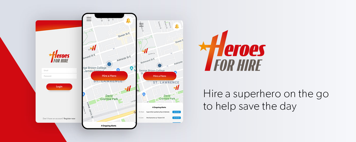
Project Overview
Creating a product concept, with a focus on Information Architecture
Heroes for Hire was a project from my Information architecture course at George Brown College. The ask was to create an app or website and build its Information Architecture.
Defining the Project
We were free to choose the theme of the project, real or fictional. I decided to create a fictional product that would be able to connect superheroes and everyday people in case they encountered an emergency situation. Because everyone needs a hero!
1. Creative Brief
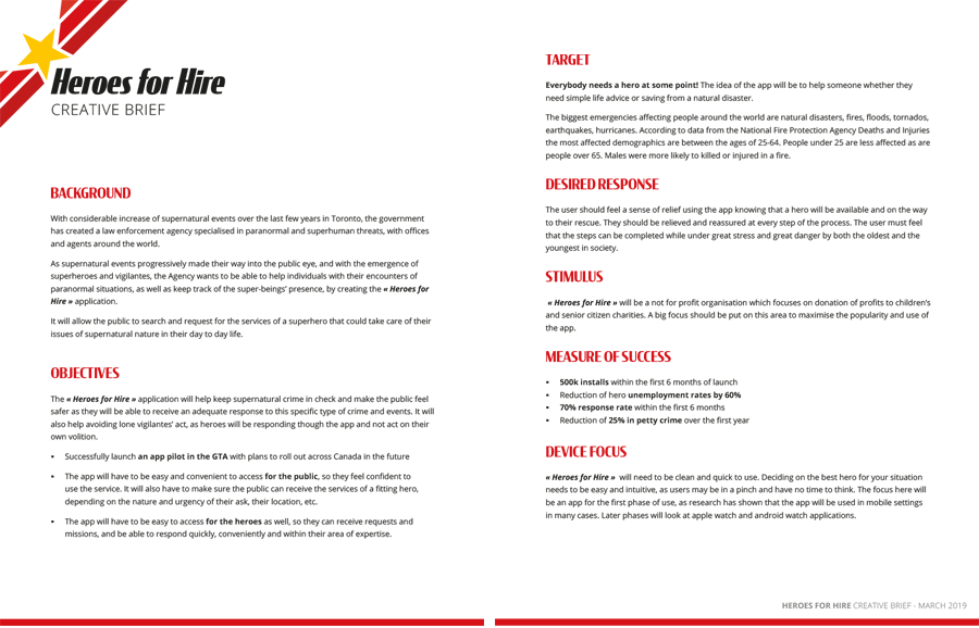 The creative brief helped define the project scope, its users and its objectives. It helped me explain the project at first, but then I was able to refer to it throughout the process so I don't lose my way.
I defined 2 types of users: ordinary people in need of rescue and superheroes to respond.
The objectives was to create a connection between the two types of users, be reliable and efficient in all levels of emergency whether they're of human or supernatural cause. Because the emergency and the need to obtain a quick response, I decided to create an app, that would allow a more flexible, on-the-go solution.
2. Personas and Users’ Journey
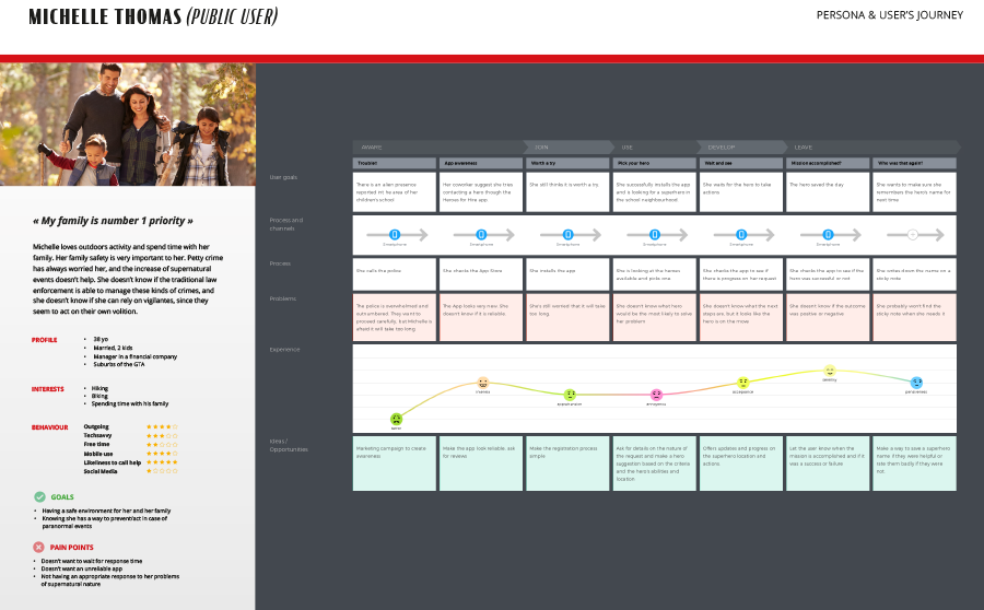
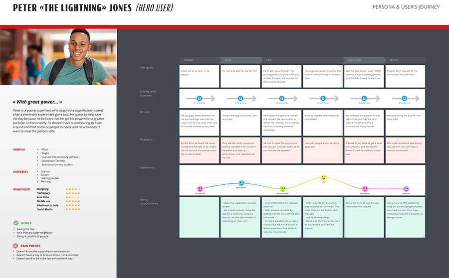
I created 2 examples of personas for the two distinct types of users and built a user journey for each of them to help identify pain points and see how to alleviate them.
Example: Peter, a younger inexperienced superhero, wants to help with a big alien invasion but is unsure of his abilities. He will hesitate to accept a mission. To remediate to this, the app could include an “Assemble” functionality, that will allow him to call for reinforcement and therefore help out, but with a superhero team mate.
3. Card sorting, site map and user flow
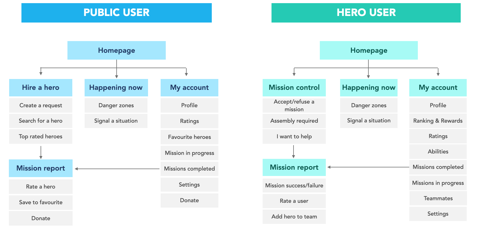 Once functionalities were starting to be defined, I went through a card sorting exercise to help build the site map and see how to regroup the pages and functionalities.
With the help of some students from the cohort, I decided how to regroup functionalities and content, to then build the site maps:
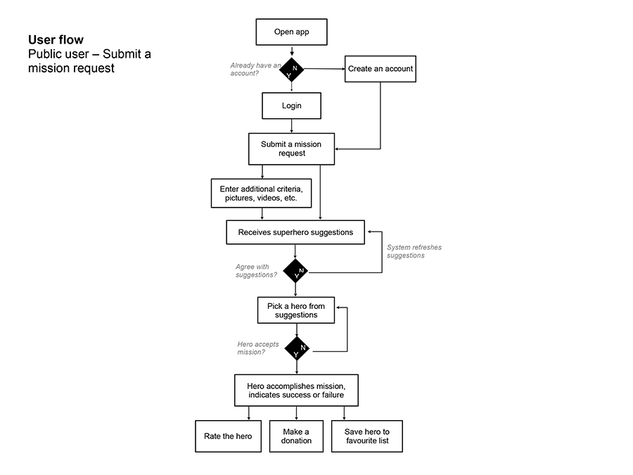
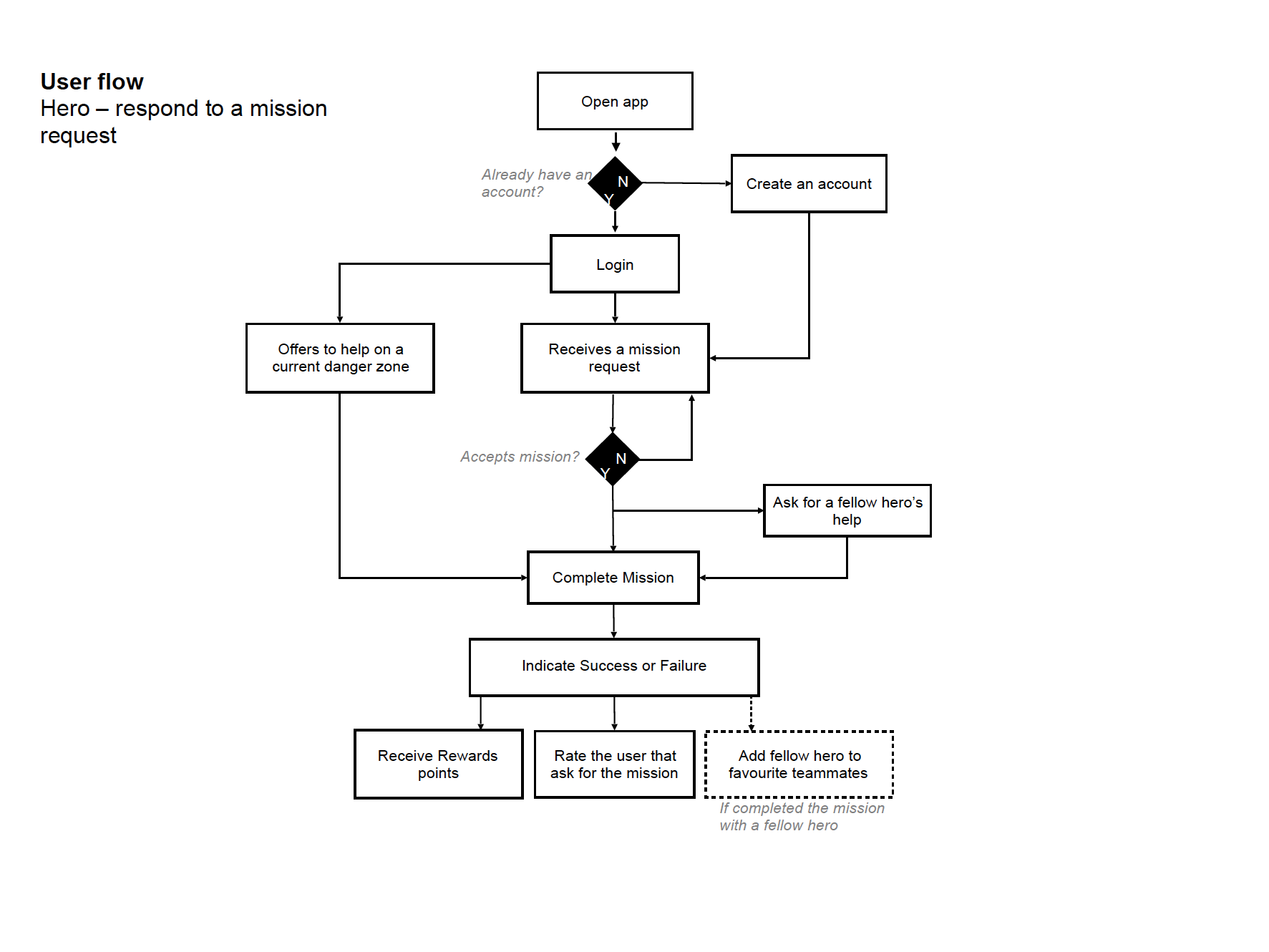
To better understand how the app would work; I built 2 different user flows.
The first one explains how a user would request a hero to help save the day, and the second one explains how a hero would use to app to take on a mission.
4. Wireframes
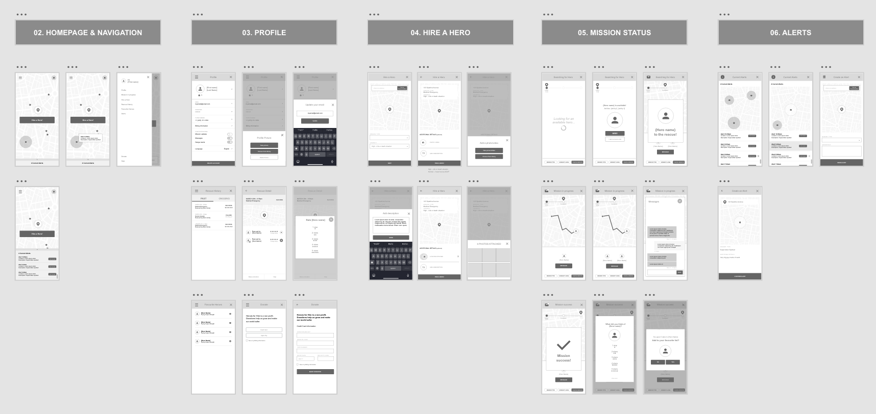
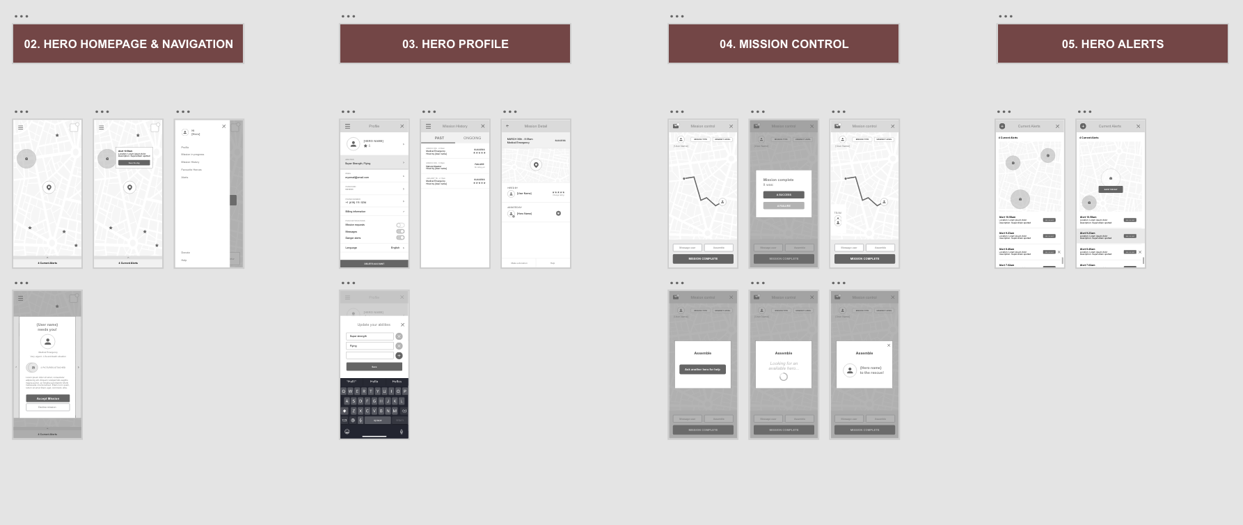
Using the card sorting and the user flows I built the wireframes to further illustrate how the app works.
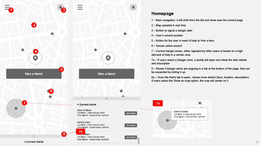
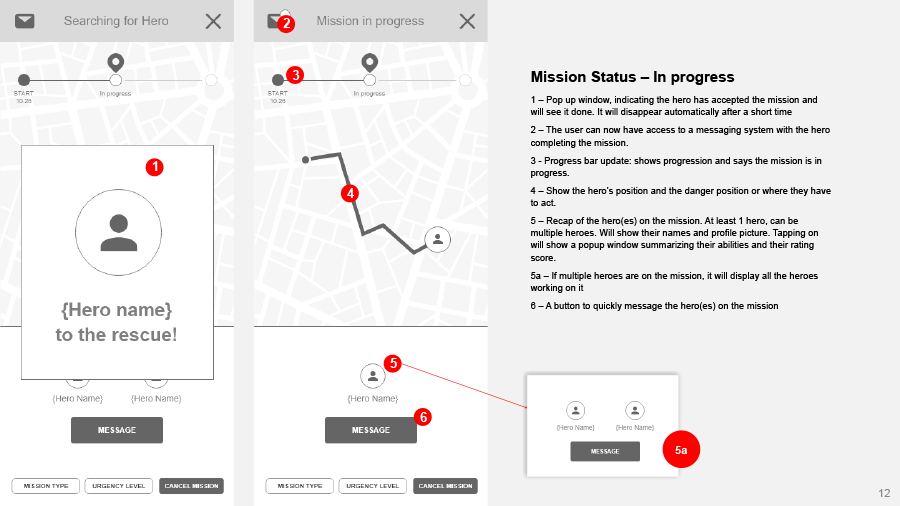
I chose to remain simple and emphasise on the main task of the app, that is the Hire a Hero functionality. All the other content would be in a menu or a tab at the bottom of the page, not front and center. Below you can see the main screens of the app and how they work together.
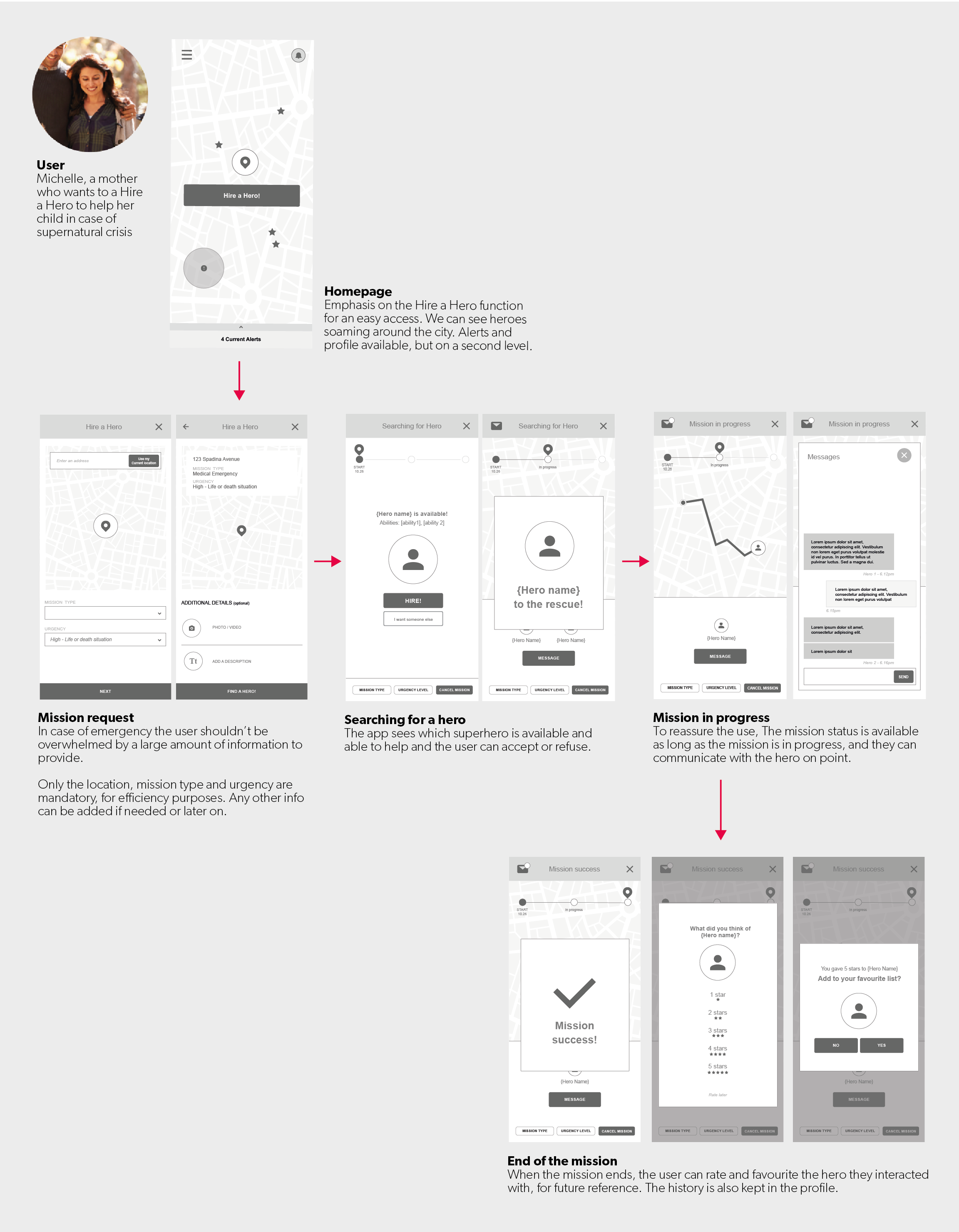
There were more screens, both for users who are looking for a hero to help and the version for the heroes to receive and accept missions. I also annotated the to better explain how the pages interact and what the functionalities are and how they work.
5. Visual and UI Design
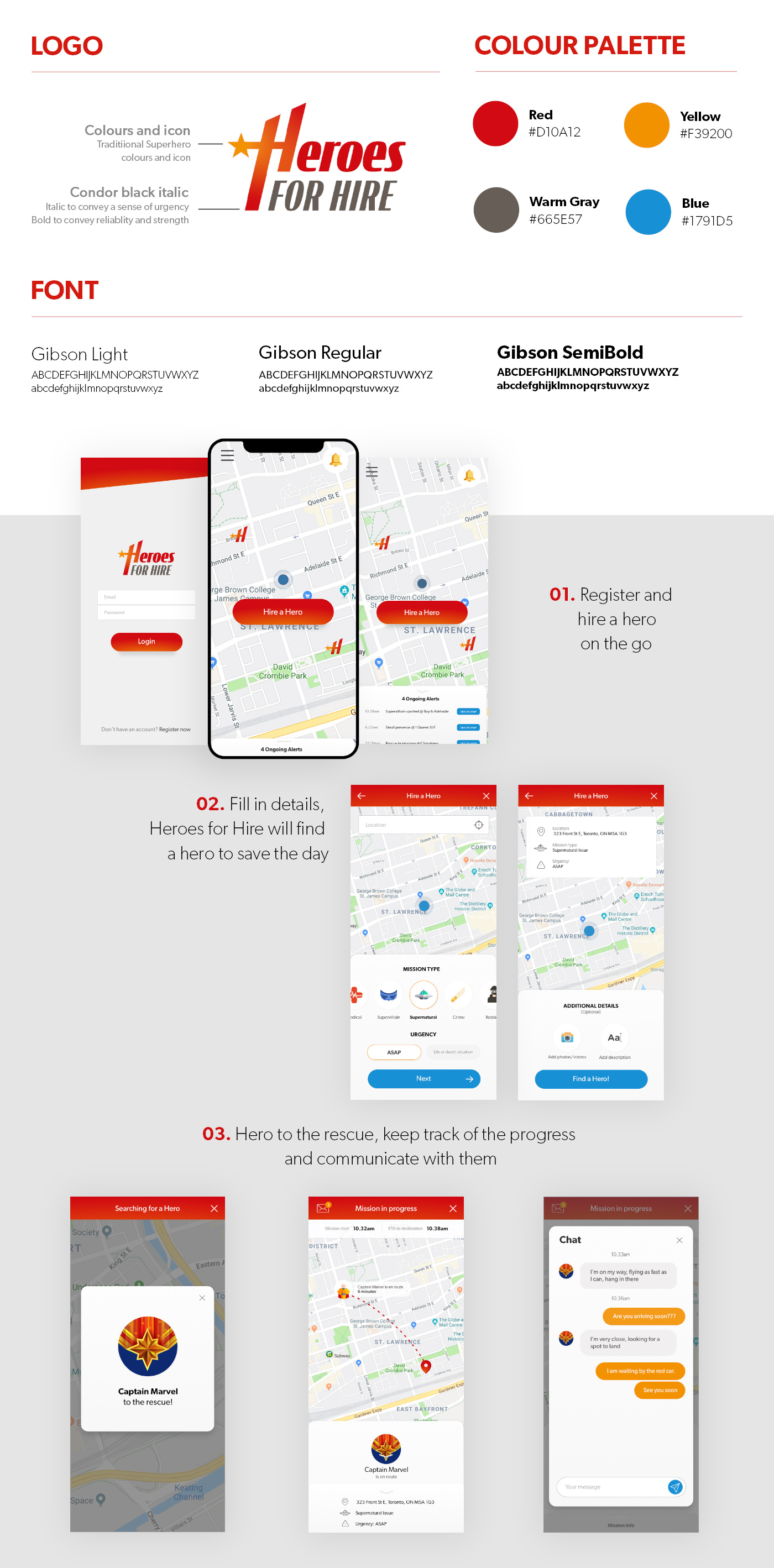
Even though the assignement was just to build the information architecture I took the time to work on the visual design as well. The first step of the visual design was to create the logo. Then, based on the wireframes, I designed a few pages. I didn't go too far in the design and it surely can be refined, but I wanted to get a sense of what the app could look like… just in case the Avengers ever need an app!
Learnings
It was very interesting to work on a product from the ground up. Although it is a fictional app, the process of building a user-centric product remained the same.
I enjoyed defining the project and the functionalities based on personas, and then put them together using user flows and site map.
It was satisfying to create even just a few pages of what the final app could look like, and even more, knowing what was behind the visual design and how all of the deliverables worked together to build a final product.