Case Study • UX/UI Design
CIBC - Call savings
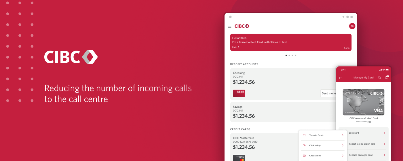
Project Overview
Within secure banking, I'm on a team with a mandate to reduce of clients calls volumes to the call centre.
TEAM
I’m working within a cross functional team, alongside a product owner, content writers, project managers, developers, business analysts, analytics and QA to ideate and deliver projects to alleviate call volumes
ROLE
For this team, my role as a Product designer is to propose solutions for the digital platforms that could help in call savings, then participate in delivering the projects by creating the visual designs and assisting development and QA.
Current situation, the problem
Everyday, thousands of clients are calling telephone banking to perform operations they can’t find or are unavailable on the online platforms. They do not only a cost to the business but they are clients irritants, which makes it a perfect opportunity for improvements.
By looking at the most common issues the call centre is helping clients with, we are trying to find solutions to improve our digital platforms, create self serve options and reduce these calls.
Examples of projects that led to call savings
Example 1 - Cancel Bill Payments
13 200 call savings opportunity
Pain points
Clients call because they can’t cancel past payments on the native app.
The functionality is exisiting in the desktop experience, but a majority of clients are using the app and are unaware of it, so they're calling the call centre to get assistance.
Solution
Our original solution was to include a dynamic link in the transactions list that would allow clients to cancel eligible payments. It turned out it would be a very costly solution to implement, so we decided to create a Bill payments history, that shows clients previous and upcoming Bill payments, and allowing them to cancel eligible ones.
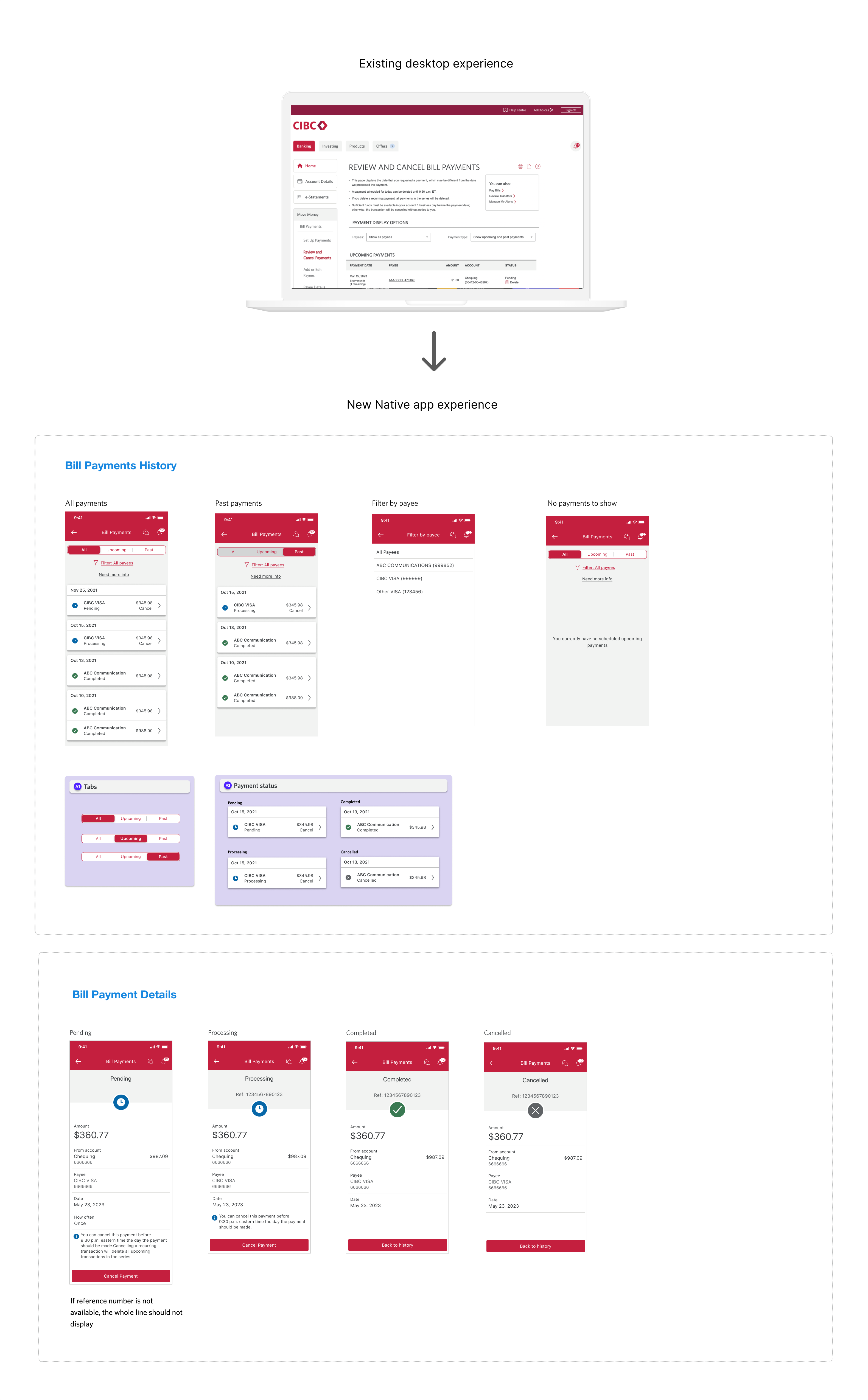
Redesign exporations
We are currently working on a redesign the Digital banking experience and a new design system.
The redesign has to be phased but we regularly explore what the experience could look like in the future, and below is an early exploration of what the Bill payment history experience could look like in the future.
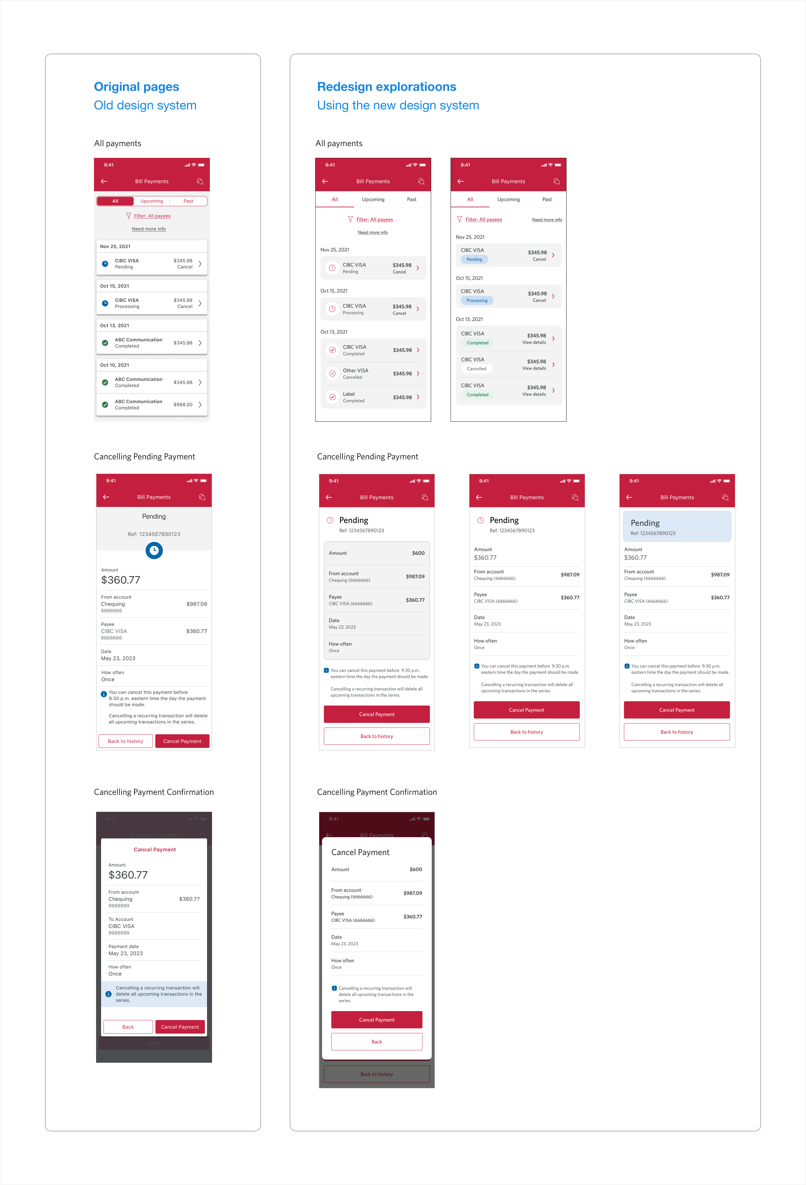
Challenges
- Make the Native experience consistent with the desktop experience, but also consistent with the different transactions history already existing in the app
- In terms of visual design, we had to accomodate the content existing in desktop within a much smaller screen size
Example 2 - Hold funds policy
10 000 call savings opportunity
Pain points
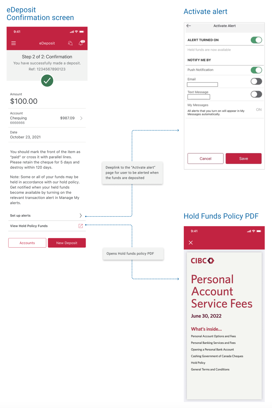 Clients call when after they deposit a cheque and don't see why their funds are not immediately available. They are unaware that the funds have to be held for a certain number of days, as per the bank policy.
Solution
We wanted to educate clients on how long their funds will be held, and help them know when their funds will be available to them.
We added additional information on the confirmation screen, after a client has successfully deposited a cheque:
- A link to the hold policy PDF. We couldn't indicate the exact number of days the funds will be held as it depends on the cheque and the client's account
- A link to activate an alert that will send the client a notification when their funds become available to them
Challenge
The budget isn't always very high, so in this case we wanted to leverage existing content (Policy PDF and alert) but make it more easoly accessible to clients
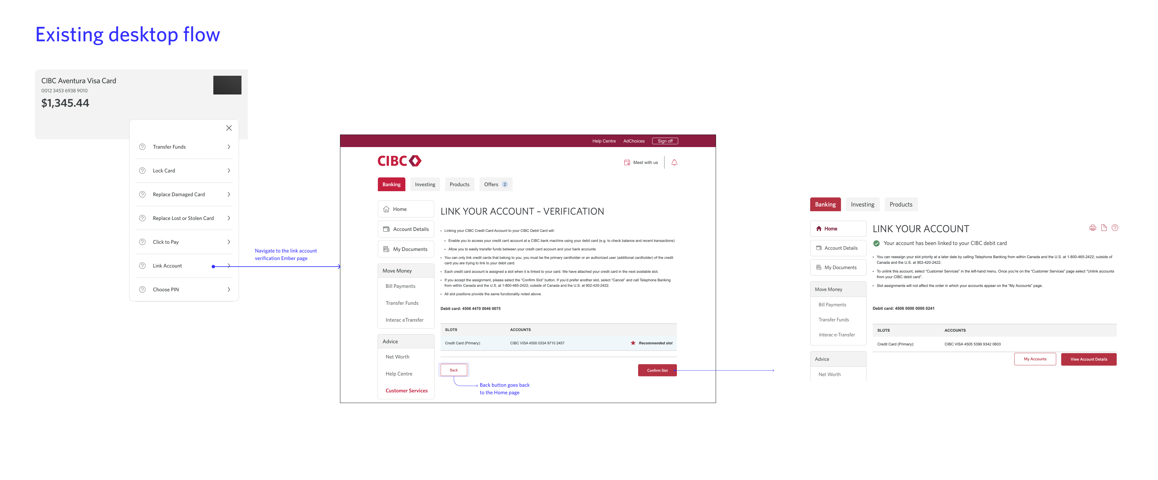
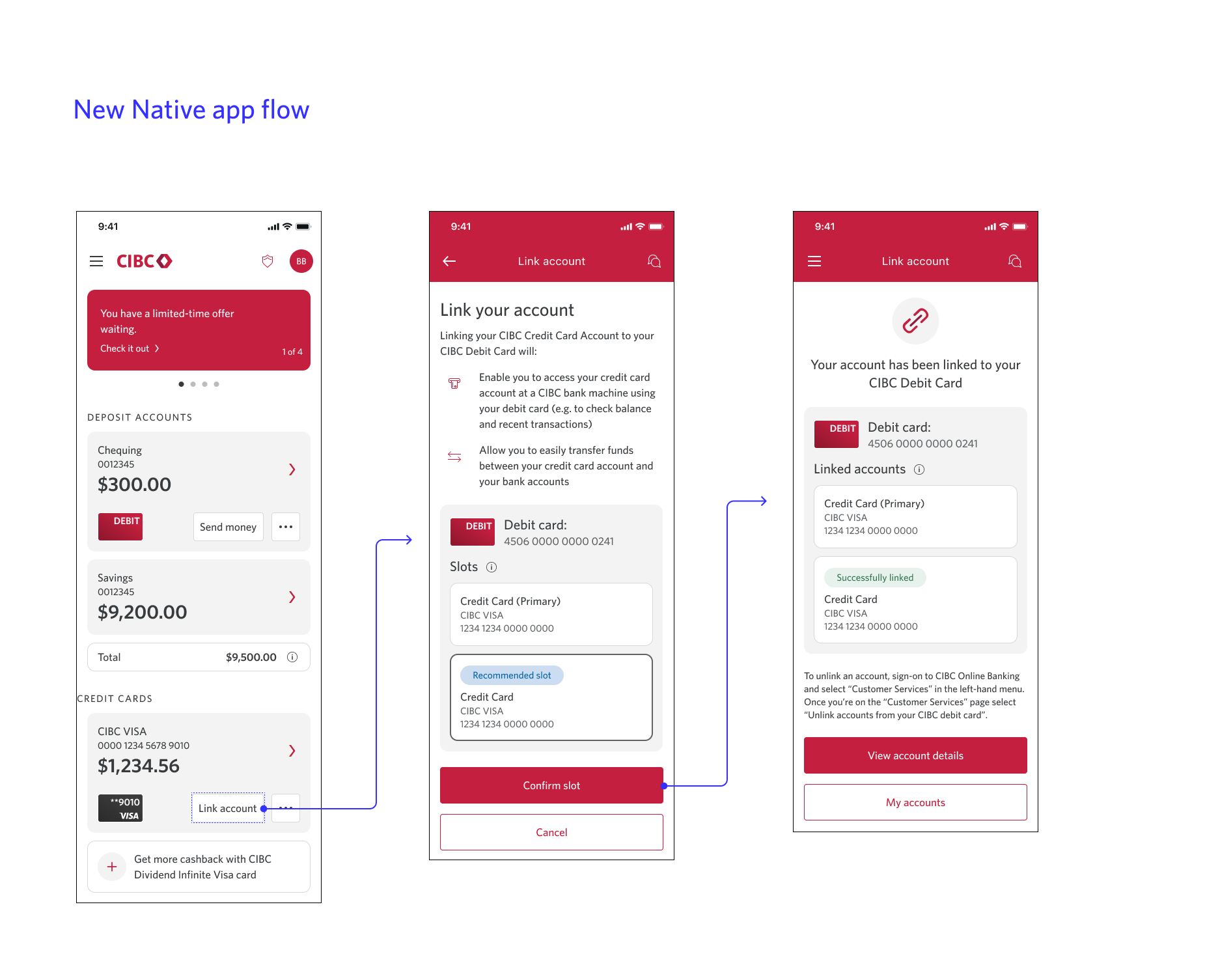
Example 3 - Link Credit card to a debit card
9000 call savings opportunity
Pain points
Clients call because
they can't link their credit card account to their Debit card the mobile app.
Solution
The functionality is already existing on the desktop version. We wanted to take the opportunity to simplify the flow, but there were some technical contstaints and we had to keep most of it as is. We still simplified the content and redesigned it with the new design system to make it look more up to date and consistent with the rest of the app.
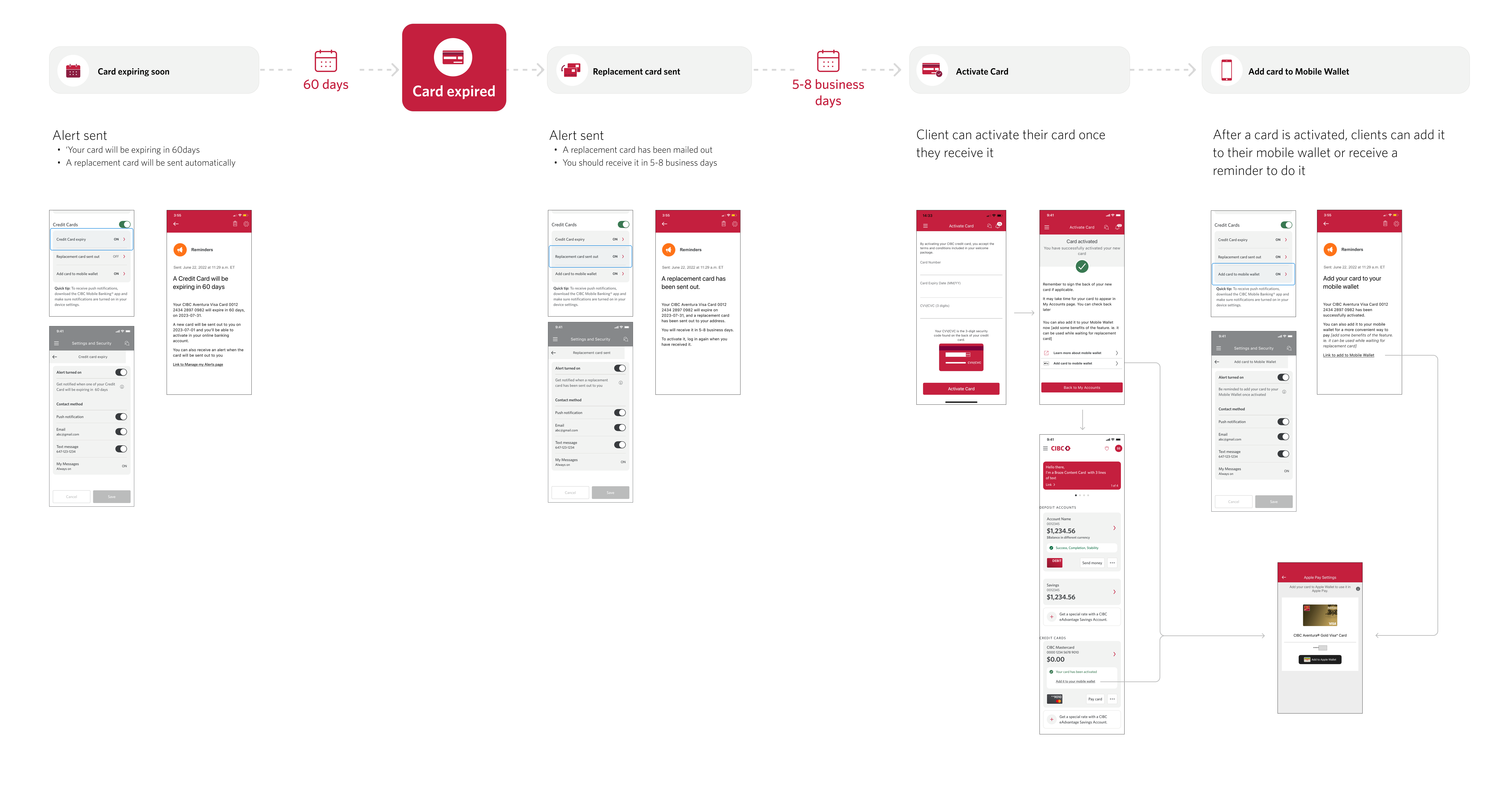
Example 4 - Credit card expiry and activation/Mobile Wallet Adoption
67 000 call savings opportunity
Pain points
Clients call because
- they don’t know when their card will expire
- they don’t know what to do when the card expires
Solution
We leveraged the alert system already existing to create new auto-enrolled alerts, letting clients know:
Card expiring soon that let clients know that their card will be expiring in 60days and A replacement card will be sent automatically
A new card has been sent out and will arrive in 5-8 days + instructions on how to activate it
We also put a stronger emphasis on the Mobile Wallet (Apple Pay, Samsun pay) feature to encourage adoption, as it can be used while clients wait for their replacement card. That way we tried to further simplify the process when getting a new card, therefore reducing call volumes even more.
Below is a representation of the user journey when their card is about to expire, showing when alerts are going to be sent and what information they will contain.
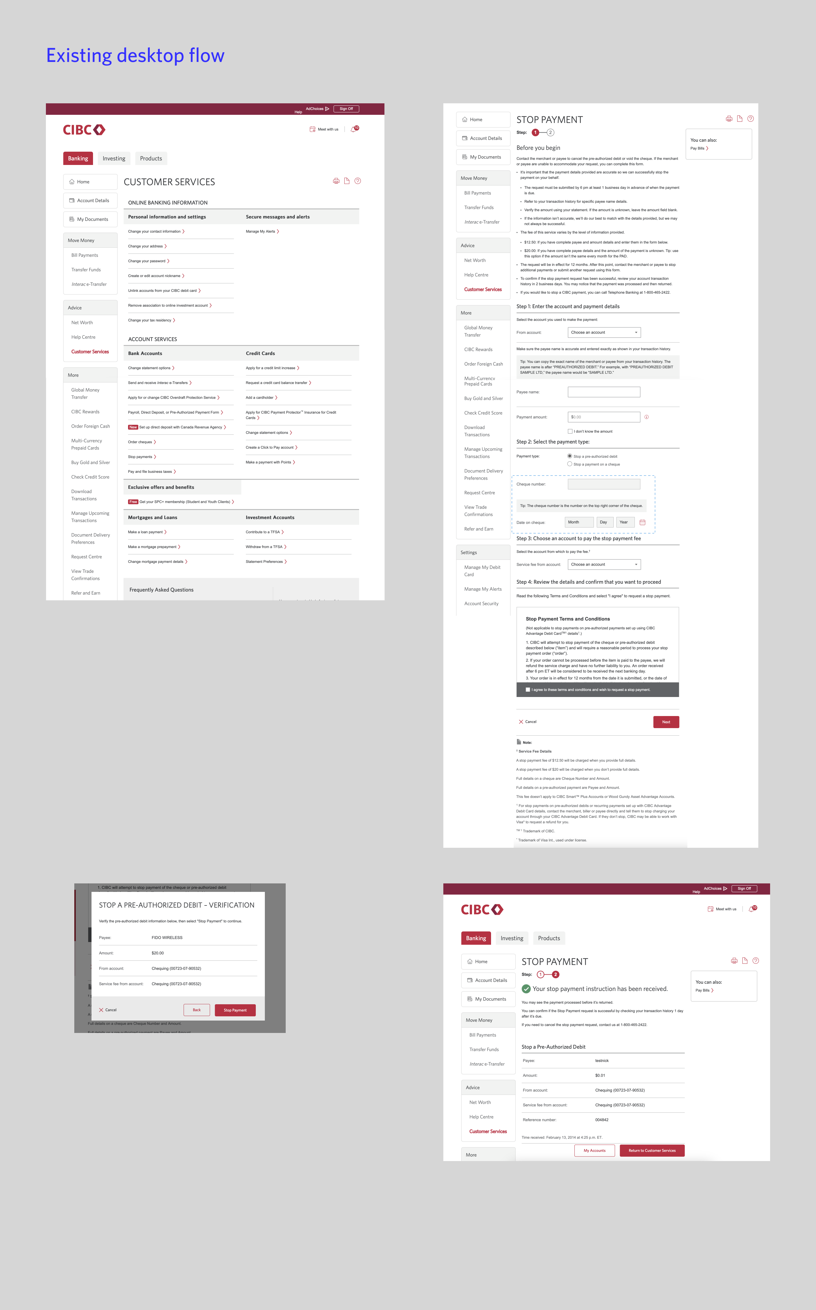
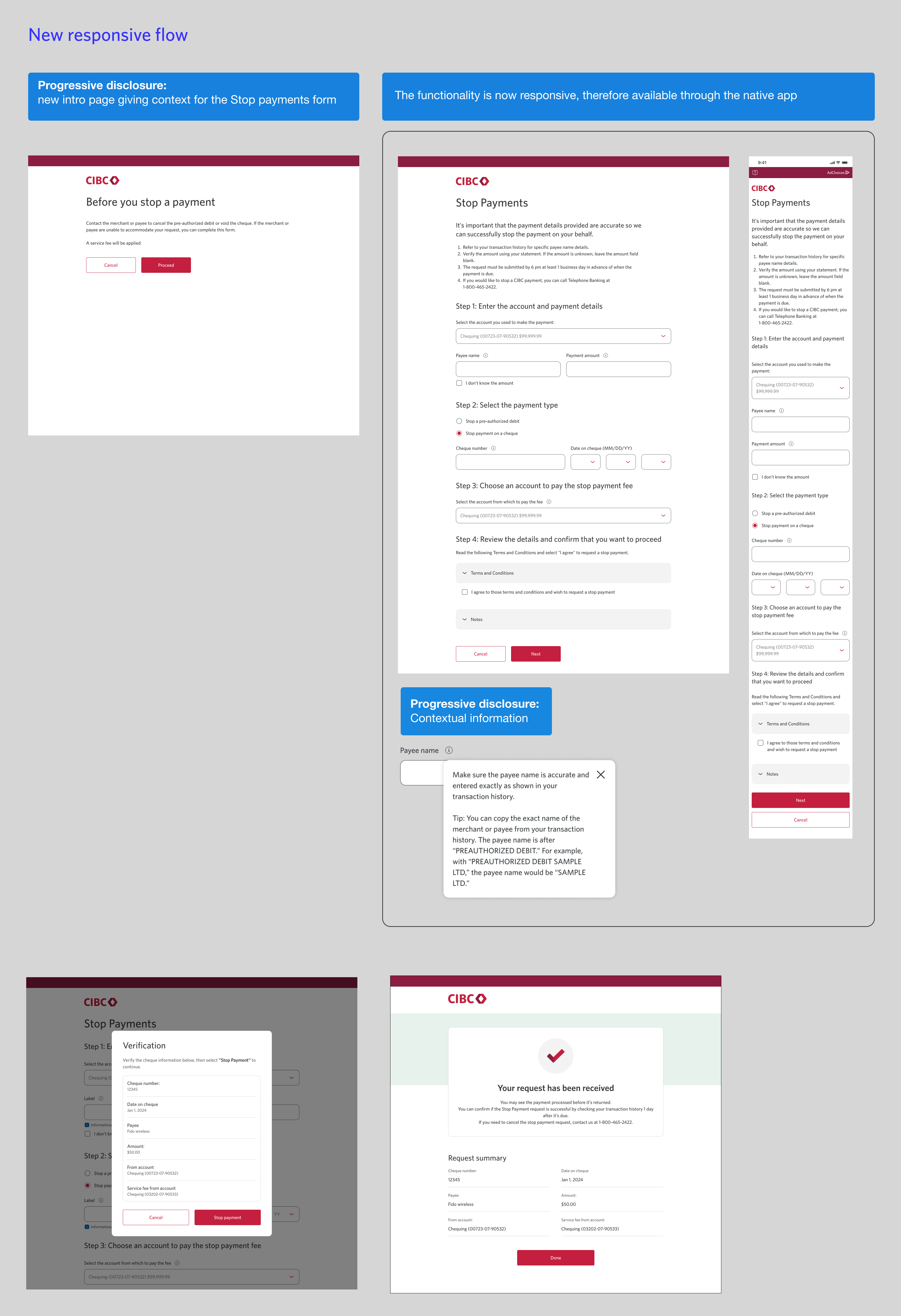
Example 5 - Stop Payments
7 000 call savings opportunity
Pain points
Clients call because
they can’t stop their pre-authorized debit or cheque payment on the Native app
Solution
- Create entry points on the Native app
- Redesign the existing form to make it responsive and therefore available through the native app
Challenges
The form is very content heavy and long. We didn’t have the budget to do more that a visual redesign, but along with the content writer, we tried to simplify the content and use a progressive disclosure approach to minimize an information overload.
1. We added a “Before you begin” page, letting clients know the essential information they need to know before and chose contextual info as opposed as a long intro text.
2.We moved some of the information into contextual information popovers
Additional benefits
By redesigning the form, we also work toward unifying our platforms using the new design systems
Learnings
At the intersection of business and clients needs
Working on alleviating the call volumes to the call centre is an interesting project, because it helps both the business and the clients. As the designer, the challenge is to keep both in mind, and try to constantly find a good compromise between business needs and user experience.
Less is sometimes more Sometimes a simple fix can help clients. As designers, we sometimes overdesign or complicate things, when a simple additional link can help the clients. It's especially important to keep this in mind when working on an already complicated platform with a lot of content, where different teams and designers are constantly trying to improve.
There's also a lot of functionality and existing content that are also existing but not in an adequate placement for clients to find. Sometimes simply rethink entry points to functionalities is an efficient solution.
As we get constant report on call volumes, we are able to see if our solutions are helping or if they need additional work or improvement. We're not able to always engage our research team so call volumes are our main metrics.
Global collaborationAs we are looking for improvements on all digital platforms, we are constantly collaborating with a wide number of teams. We get to work on a lot of different areas of the platforms, giving us overall knowledge, but we also have to make sure we are not in conflict with other projects.