Case Study • Visual Design
CIBC - Smart Planner
Context
We believe an idea, however unique it is, remains a concept and a mere representation of thoughts. It's the execution plan that gives real vision and direction to an idea.
We took an existing part of the app that wasn’t performing well to try out a different way of working.
Instead of rethinking the flows, how the functionality was working, we focused on execution and visual design to improve it.
Time Frame
2-3 weeks
Team
2 designers + Content writer
Process
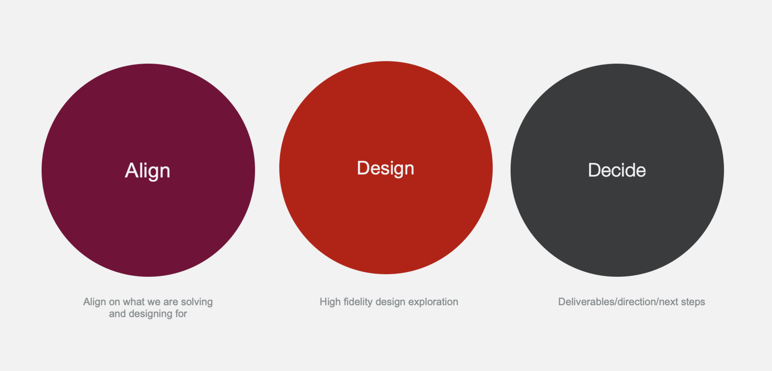 We looked at the drop off points of the CIBC Smart Planner and identified improvement opportunities.
For each ones, a design sprint was run, where we ideated high fidelity designs. I participated in one of the sprint.
We looked at the drop off points of the CIBC Smart Planner and identified improvement opportunities.
For each ones, a design sprint was run, where we ideated high fidelity designs. I participated in one of the sprint.
Once we had several options, we sent prototypes to the UX research team to test the ideas with users, that could then be proposed to the delivery teams so they could implement it.
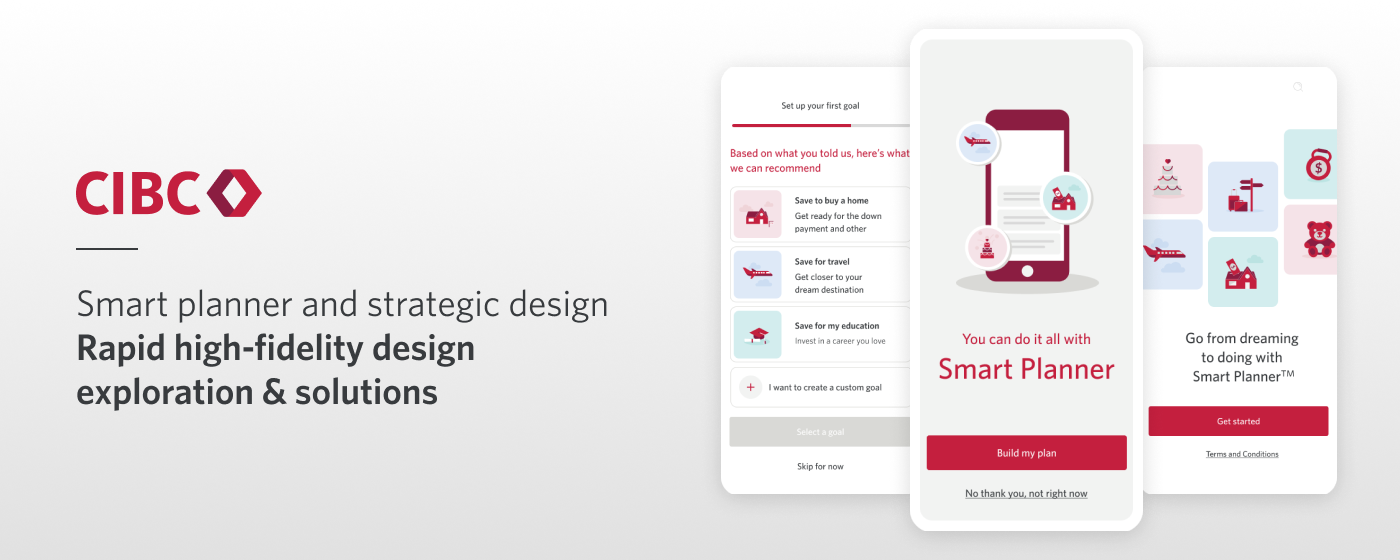
What is Smart Planner?
A digital first planning solution for Core Clients rooted in relationship building that aims to help them with their day-to-day money management including budgeting, goal planning, advice and transaction insights to meet their short-medium term objectives.
Improving the Smart Planner onboarding experience
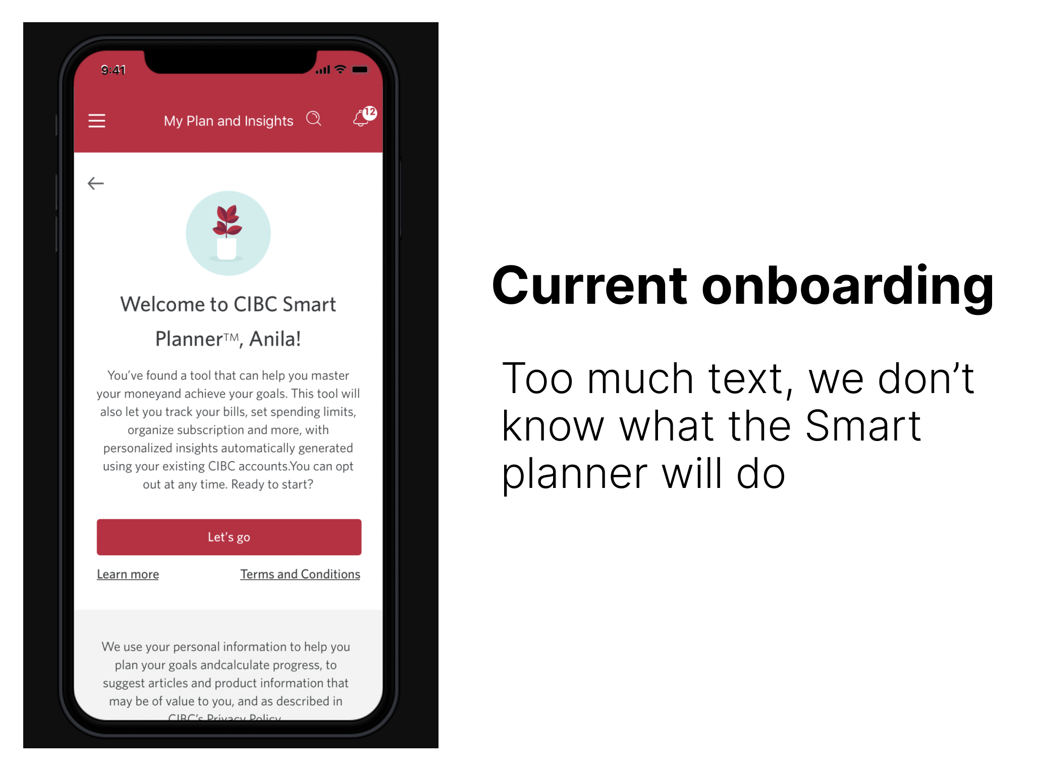
We wanted to address the drop-off rates. Users were getting through the introduction of the tool but were not creating goals nor activating their alerts.
After identifying these goals, we started designing concepts, high fidelity design explorations and solutions focusing on visuals and content, with the help of the content writer.
User Testing
After a several rounds of ideating and iterating, we landed on 2 strong concepts, turned them into clickable prototypes to perform user testings.
The user testing showed that the simplest version was performing much better. Users liked that it was clear and straightforward, and they knew what to expect from the Smart planner. As for the alerts, neither of the placements work well
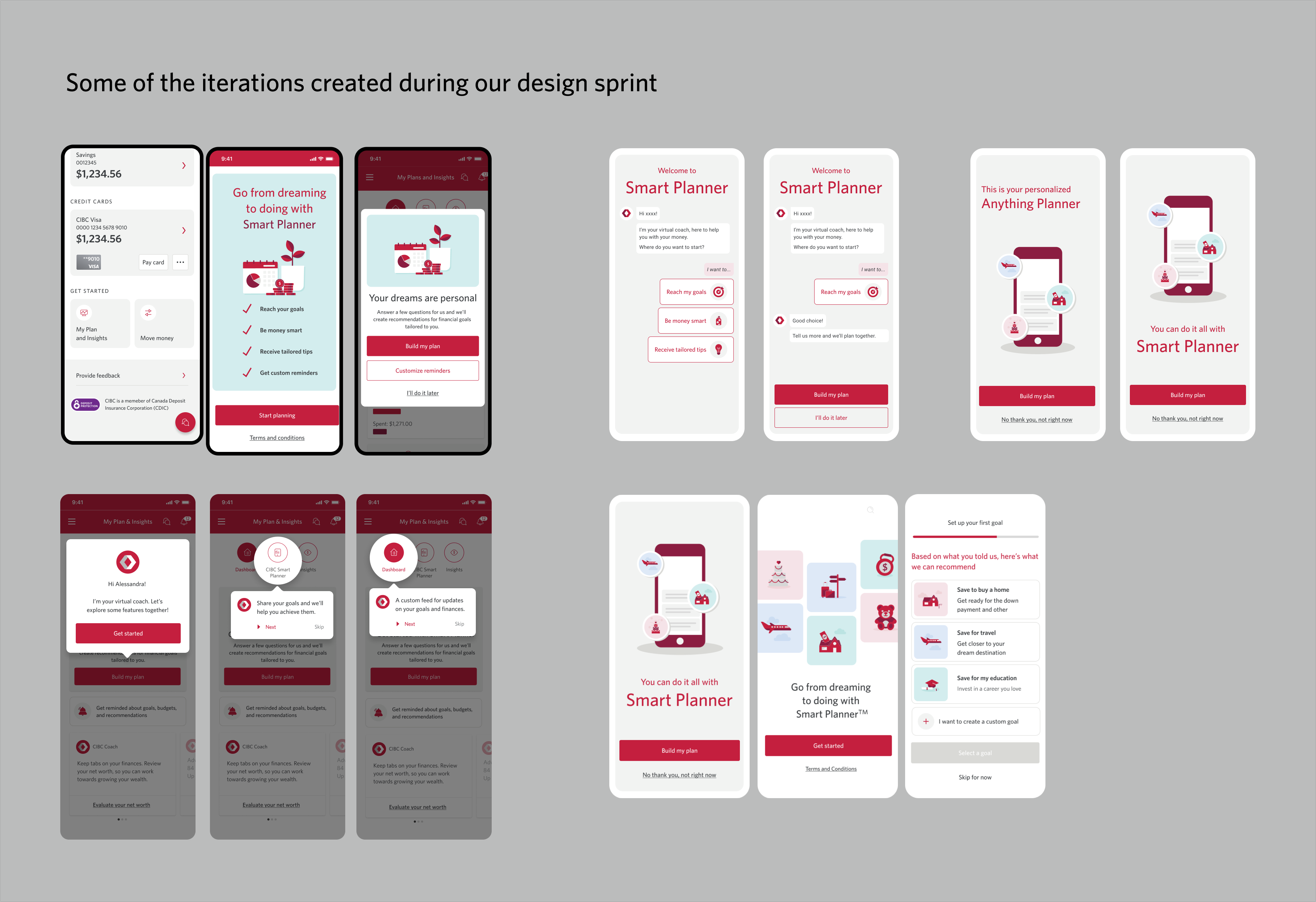
With the user testing results and all kinds of concepts explored, we were able decile it would be a good project to work on further and send to delivery.
Learnings
Lots of ideas were rejected but lots of smaller chunks can be repurposed to create new flows and concepts
During the design process, all ideas were worth exploring. A lot of them didn't work because of feasability, cost, or the idea was simply not that good, but it can help get to the next idea, or an initial idea can be reused later.
Importance of content and visual design- We know how important flows are, how everything works. But sometimes Visual design and execution is not given the same attention. By working on these design sprint with a particular attention to visuals, it was a good reminder that a great idea will only perform with a great execution
- We worked on these concepts with a content writer, and it makes a great difference. We were able to create concepts with a better sense of storytelling. It showed us the importance of copy, rather than working with placeholder text, but also how important the collaboration between copy and design was
We explored different ideas and concepts, we thought some of them were out of the box and believed would be interesting. But at the end, sometimes a simpler idea, more straightforward was more efficient