Case Study • UX/UI Design
ebb
Project Overview
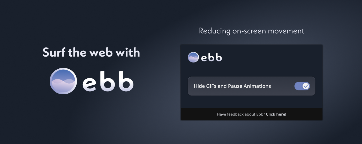
Ebb is a Chrome extension that reduces moving site components to make web browsing more inclusive and accessible for neurodivergent users.
Time frame : 7 weeks
I worked on this project as part of Co.Lab, a training program that paired Product Managers, Product Designers and Software Developers to work on a real-life project with the support of mentors using an Agile process.
Team: 1 Product Manager, 2 Sofware developers and myself as the Product Designer
Within a cross-functional team of 4, I lead the efforts to understand customer pain points and gathered insights to back up design choices, before and during the development of the product and created the Visual design of the product
1. Defining the problem
When I joined, the Product Manager chose to work on a specific problem space: Websites are often inaccessible due to UX, with designs that cause users physical pain, discomfort and distress, especially for neurodivergent users.
Some users experienced physical pain and/or emotional distress from inaccessible websites UX/UI
“Had a migraine for the rest of the day”
“That website makes me ANGRY!”
“It’s super frustrating to not be able to read the information that I need for my health”
Prior to me joining the team, the product manager had sent a survey that got 31 respondents and they interviewed 4 potential users more in-depth.
We analyzed the survey responses and interviews together, we found out that :
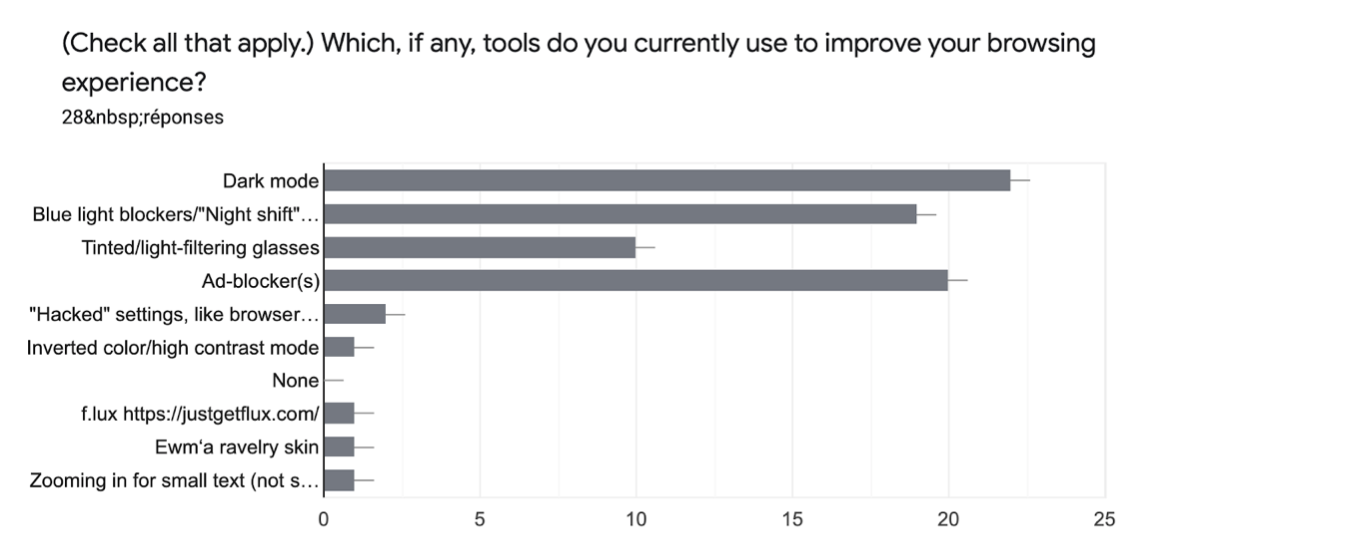
- Users either navigated out of websites or used a various number of solutions to help alleviate issues they were encountering online (ad blockers, blue light filters, dark mode…)
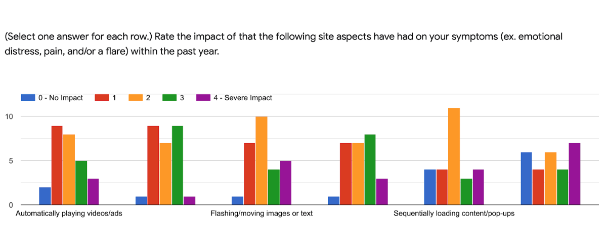
- Movements on webpages were having an impact on users’ symptoms (ex. emotional distress, pain and/or flare)
It was a problem that had to be addressed, because everybody should have an equal access to the web especially nowadays where so much is online, whether it’s social, for work or administrative
We defined 2 different types of users:
- Users that have physical painful symptoms from online experiences (migraines, eye strain, etc.)
- Users that have a lower attention span and get distracted easily.
Based on these profiles, we created user journeys based to highlight pain points and spot opportunities.
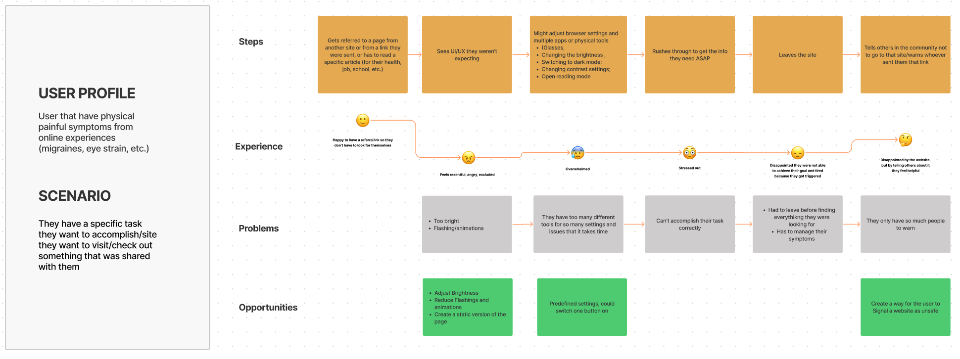
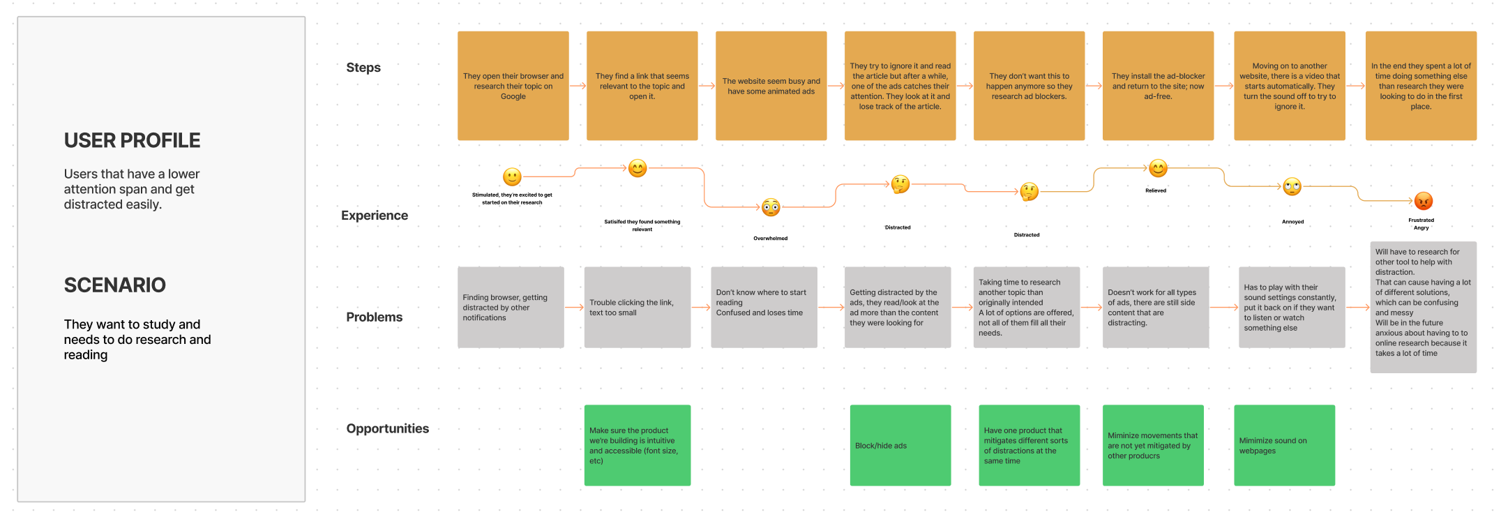
We settled on one main pain point because we wanted to narrow down the scope and decided to find a way to mitigate moving objects and animations that could be distracting, painful or challenging for our users.
Our problem statement:
"We’re aiming to minimize moving web page components, making browsing more inclusive and accessible for millennial, neurodivergent users, so that they have safer and less painful online experiences."
2. Ideation
Our first idea was to build an iPhone app, because it seemed that it was the device our targeted audience seem to use the most, especially when feeling unwell. But given the time and the stringent process of getting an iPhone App approved, we pivoted into creating a browser extension. It would still benefit our audience, since desktop experiences seemed to cause a lot of trouble and distress, so diminishing cause of harm on desktop could still be helpful.
In order to determine our MVP:
- We had a few brainstorming sessions all together with our two developers and our PM to determine what was feasible in the time frame
- We also researched what was already existing so we could build something that doesn’t exist yet
- We worked on prioritizing features, depending on what impact and level of effort for each.
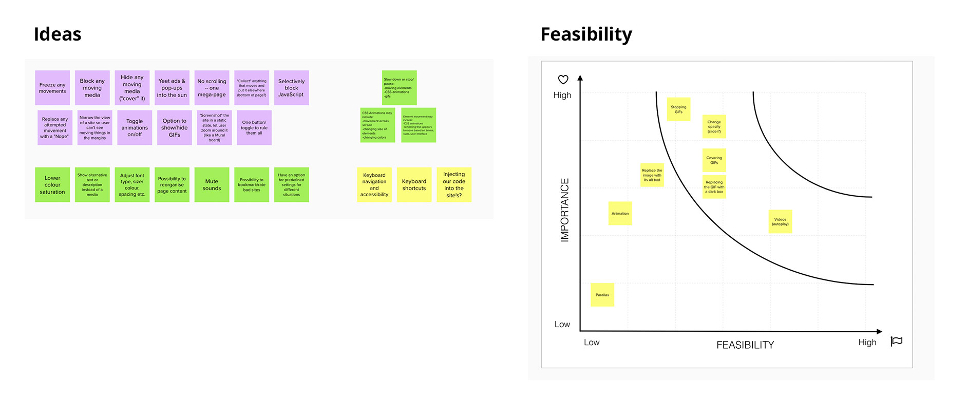
We already decided to build an extension that would minimize movement on webpages, and after exploring solutions to stop videos on autoplay, ad or mitigating scrolling animations, we decided to target GIFs first . This solution didn’t seem to exist and it would be impacting a number of on-screen movements for a start.
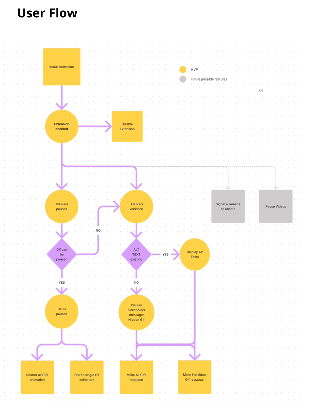
3. User Flow and Wireframes
With the rest of the team, we defined how the tool would work and I created a simple user flow that shows how the user can interact with the extension, and the options that they can have.
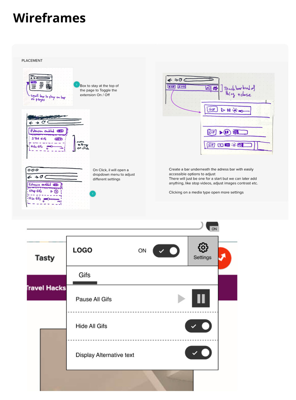
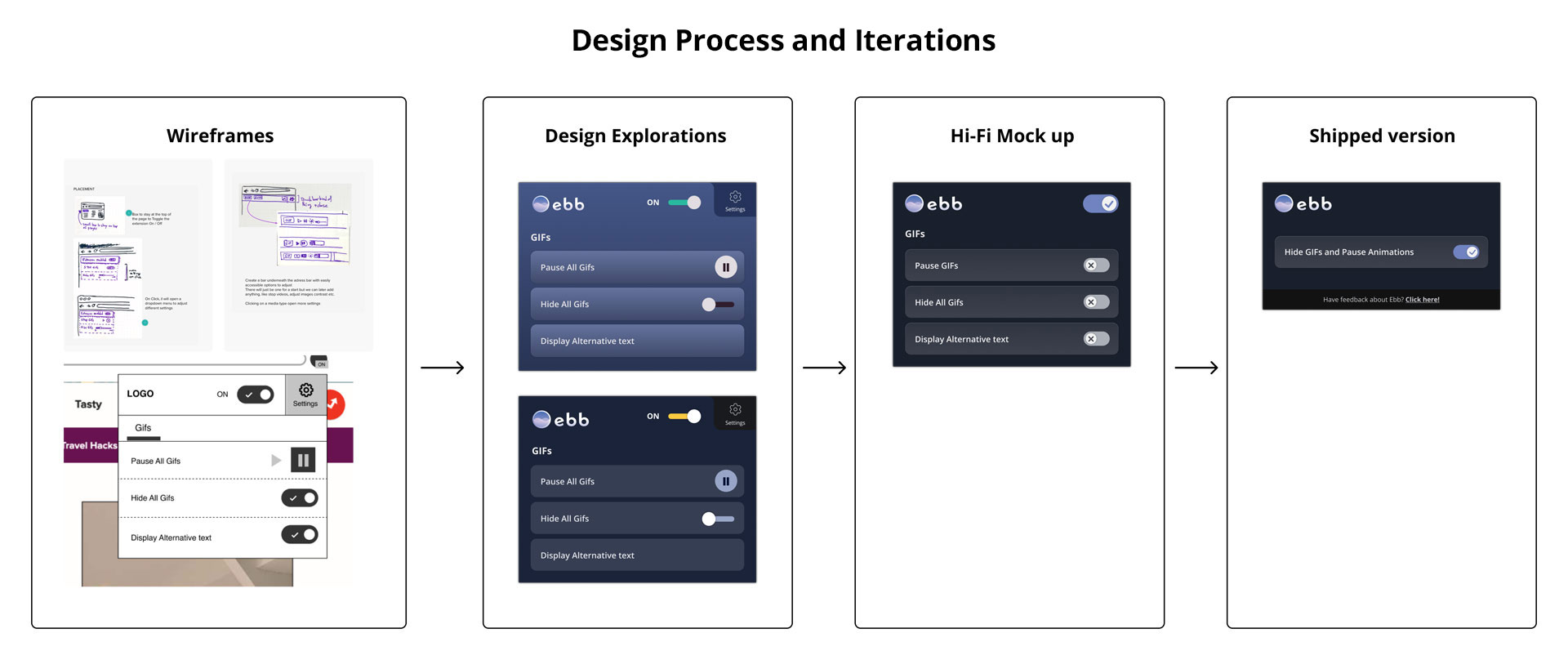
Based on the functionalities, I was able to start on making Lo-fi Wireframes, exploring different options such as having a navigation bar created, or have a menu appear on the page.
We had determined early on that Ebb should follow inclusive design principles, which aim is to use design to create a feeling of safety and trust, allowing the user to feel empowered and safe while using the product.
So we settled on simply having a pop-up appear underneath the extension icon, because it is the most used way that extensions work, and we wanted to create familiarity which is important with users that are already using their desktop browser reluctantly. It would also avoid extra clutter on the page.
4. Visual design
Early research showed that a lot of our targeted users were using dark modes when possible to avoid eye strain caused by harsh colour contrasts. Based on that and the fact that we wanted to create a soothing, calming and safe environment, I created the logo and a basic design system that would encompass all of that.
I started with creating the logo, with 3 different versions and the team settled on one.
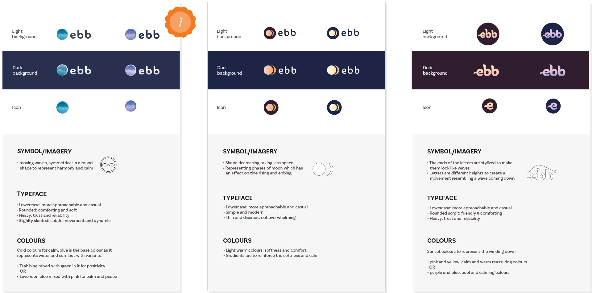
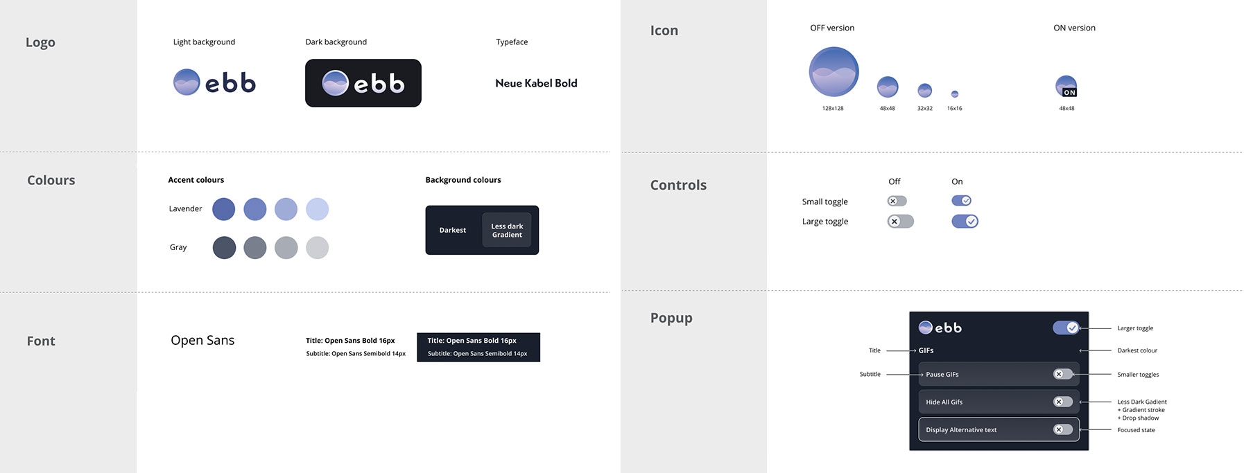
The popup window for the extension would also be in a dark mode aspect for a less harsh visual environment, to be less straining for users with photosensitivity for example. I chose a main colour that was based on the purple from the logo and used it as a subtle overlay over a dark gray to create the background colour, and used the lavender colour as a subtle accent where needed.
Where needed, I used visual cues additionally to the colours (like the checkmarks and crosses) so that users that can’t distinguish colours can also use our product without trouble.
After that I handed off the design to the developers to implement it in the functional product. I created a simple Style Guide with the different components and colours, and annotated the mock up for an easier hand-off.
I also had to refine and adjust the design based on the time crunch we were on and how we prioritized and pivoted features in the end. I worked closely with the developers to implement the changes needed.
The shipped MVP would only have a single toggle and a link for users to be able to share feedback with us.
5. User testing
At the same time, we developed a user testing plan to test the product concept and usability, and find how we could iterate and improve the overall experience.
We wanted to test the product concept as well as the usability of the extension at the same time, because we didn’t want to burden the targeted users, that already don’t want to spend more time on a screen than needed, with multiple surveys and tests.
I created a clickable prototype for the test, that could be used for live interviews, but that could also be included on a remote testing platform so that users could test it on their own for more freedom and convenience.
We created screening questions first, to make sure the users who would take the test were in our targeted audience. Out of all respondents, we had 9 users take the remote test, with 7 of them complete it until the end.
In the test, we asked users:
- to compare their experience on a webpage containing animations, with and without the extension
- to interact with the extension’s settings and interface
- to comment on the interface (aspect, intuitivity, etc.)
- if the product was useful to them
- whether they’d be likely to recommend the extension (to measure Net Promoter Score)
- what were two aspects of Ebb that they disliked and/or liked
6. User test findings
User Feedback:
“I really like how simple and easy it is to use! So many accessibility apps have waaaayyy too many options and information, but Ebb is done just PERFECTLY!"
Overall the respondents had positive feedback regarding their experience with the tool, how it worked and what it did.
Our two key metrics of usefulness and the Net Promoter Score performed well:
- On a scale of 1 - 5, how useful did you find Ebb? 4.8 average
- On a scale from 0 - 10, how likely is it that you would recommend Ebb to a friend or peer? 9.3 average
Out of the users’ experience and feedback they shared, I analyzed the report and was able to pinpoint some possible next steps that we could improve or add to the product.
I made a list of these possible next steps, like adding features to pause GIFs, mute sounds, pause videos on autoplay, and we’ll determine as a team which one we want to take action on, based on impact and level of work.
Next steps
Team ebb will continue working together on the product! The next steps will include reviewing the User test findings as a team and see how we can take the product further and make it a one-stop solution for accessibility controls.
Achievements
In a 7 weeks timeframe, we created a publicly available, functional MVP for our product. It's available for download on the Chrome Extension store.
We also were one of the three teams out of 15 to be awarded the opportunity to present on Co.Lab’s Product Showcase. Check out our full product journey here: Co.Lab Ebb page project
Learnings
I got to learn by doing, trying and finding solutions to specific problems. It was 7 weeks full of learning opporunities with and from my team. If I had to sum it up in a few bullet points I would say I learnt:
- to use various research methods and cater them to specific needs
- To design following inclusive design principles and deeper knowledge of accessibility
- how to prioritize, pivot and adjust constantly to release an MVP within a short deadline
- to collaborate with brand new teammates with different skillsets
- about working in an Agile setting
- to use Figma for the design, developer handoff and prototype building