Case Study • UX/UI Design
Oyster
Project Overview
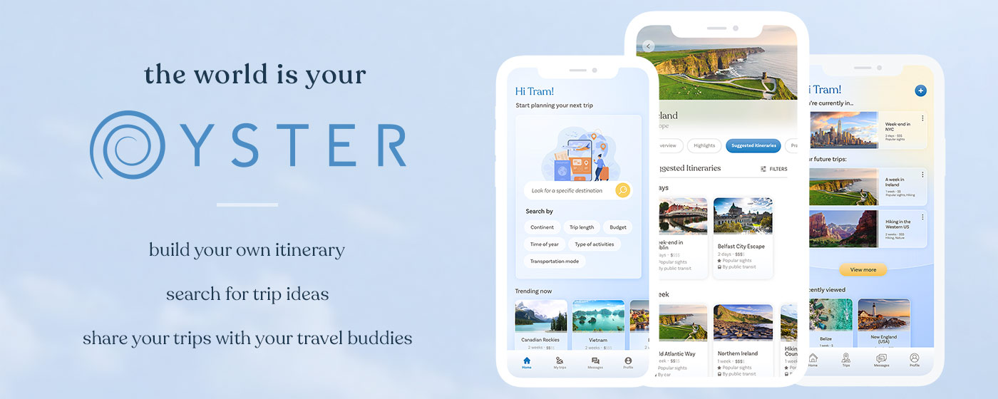
Oyster is a travel guide that fits in your pocket.
Research, plan and organise your trip all in one place, with trusted recommendation, user’s reviews, destination information, inspiration and a trip planner. All in one app so the world can really be your Oyster!
It is a concept app and a passion project that I was working on to practice various UX/UI skills.
1. Problem validation & User research
I like to plan travels, trips and ideas of itineraries, whether I’m actually going or not. I struggled with finding good recommendations and then keeping notes of them. It was scattered across Google docs, Maps, saved items on Instagram etc. I started wondering if there was a better way.
So was it just me or could a solution to my problem could help others too?
I reached out to some friends with a survey to understand their travel habits, talked to a few of them, to see what kind of research they were doing before going on a trip, and how they kept record of it.
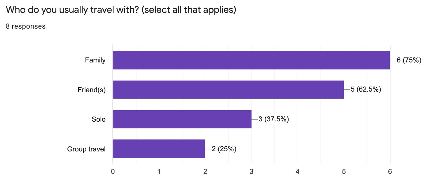 From the survey responses, I made a recap of their behaviours, pain points and what these potential users were looking for when planning travels. I used all of this to determine opportunities and solutions that a product could help with.
It appeared that all of the respondents were planning their travels beforehand in some kind of way, looking for trusted recommendations and keeping notes in their phones or some kind of device. They also traveled with friends and/or family mostly, so I could also find a way to share travel plans between users.
After gathering these insights, I decided that I could build an app: a digital travel guide that would provide trusted recommendations, itineraries suggestions for those who don’t like to plan everything themselves, coupled with a trip planner where you could save those recommendations.
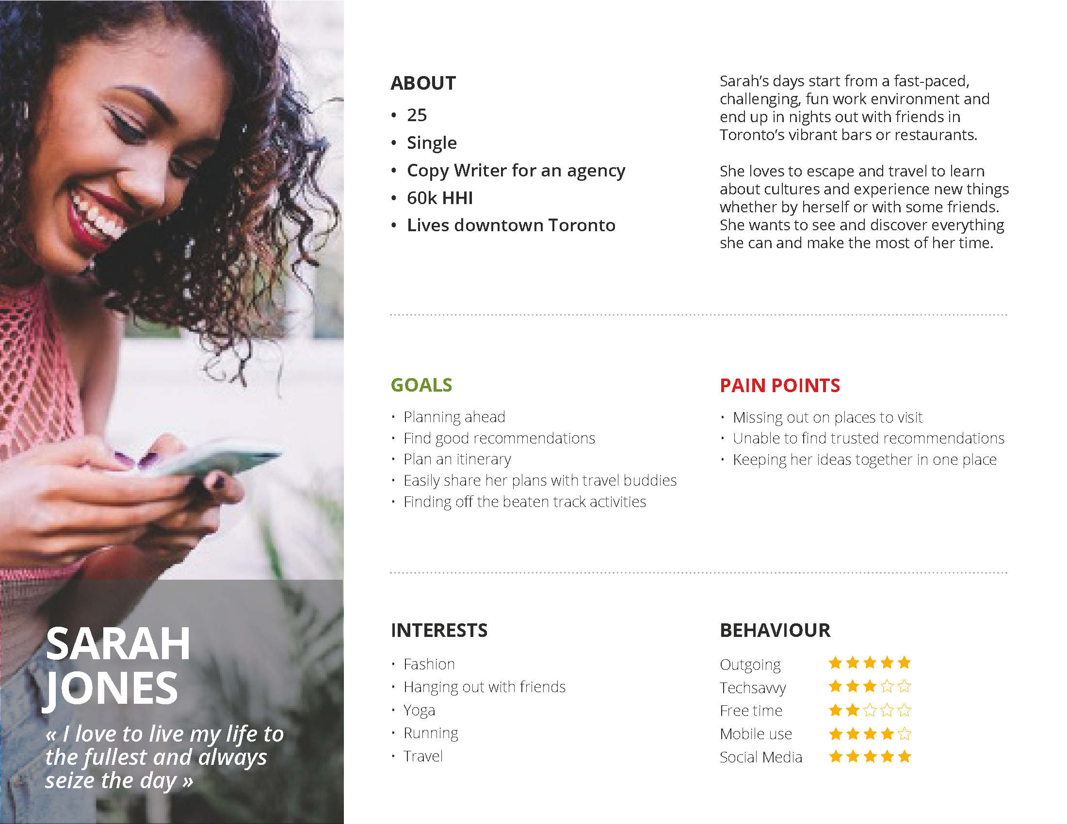
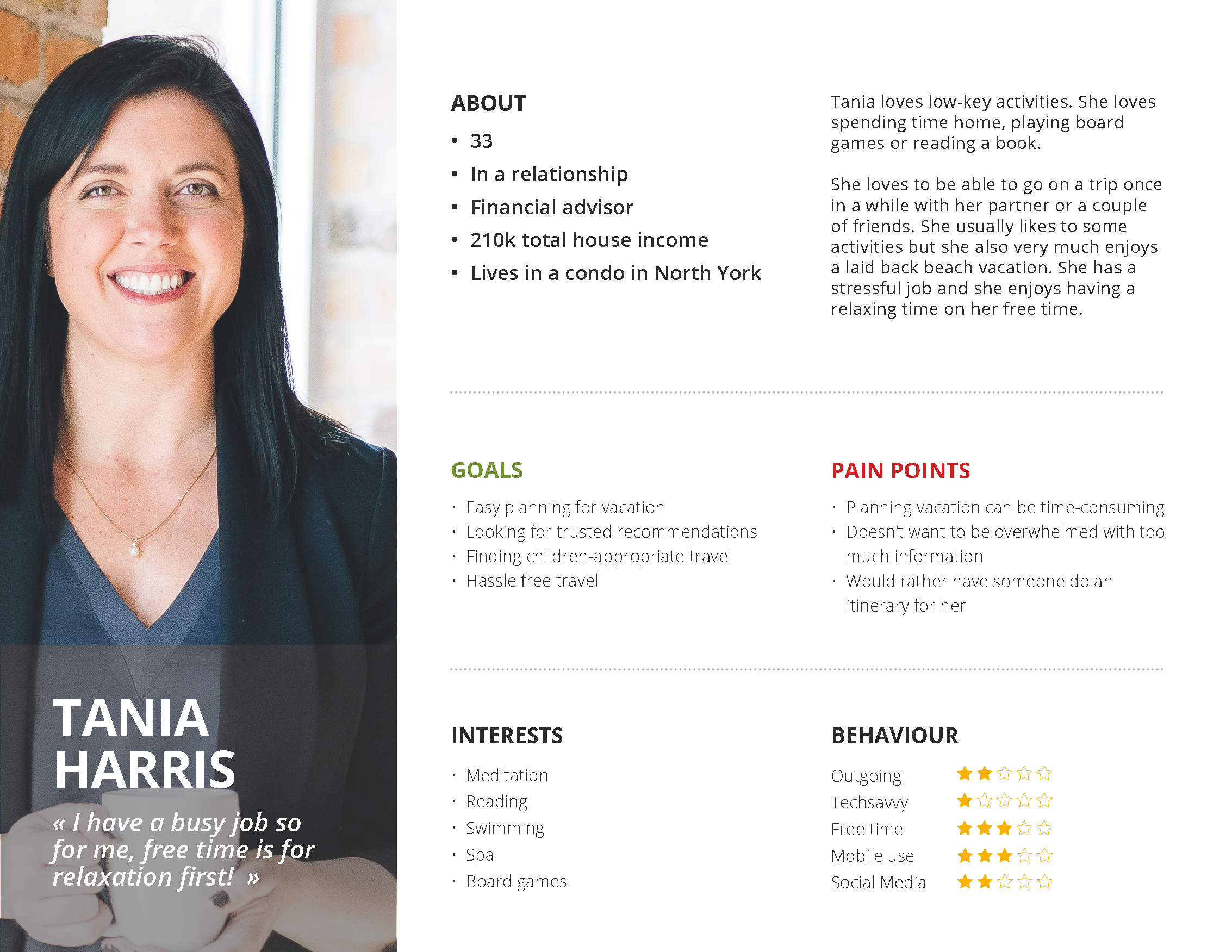
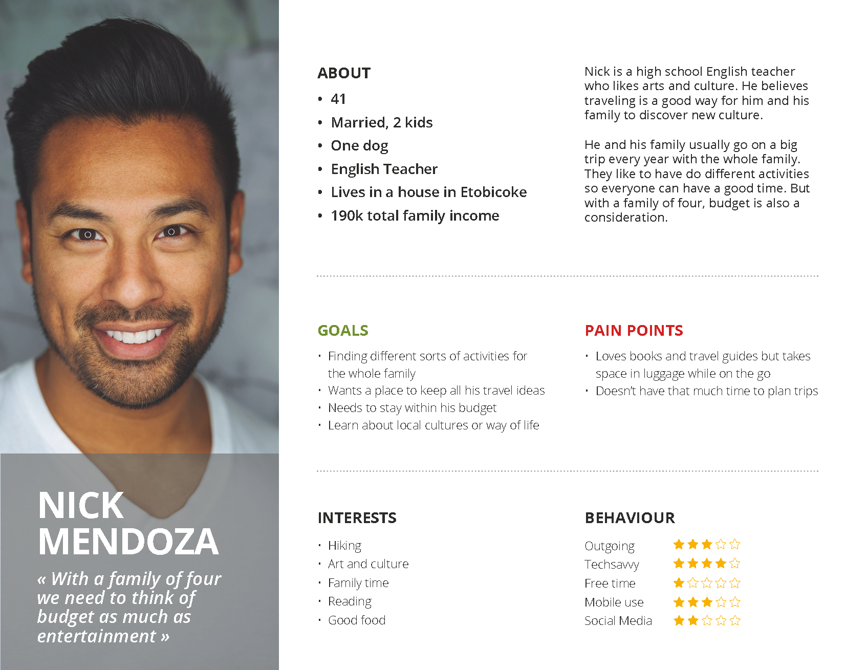
I also used the responses to create 3 personas, to regroup the users’ into main profiles and better understand their needs and pain points and build a solution from these.
2. Site Map & User Flow
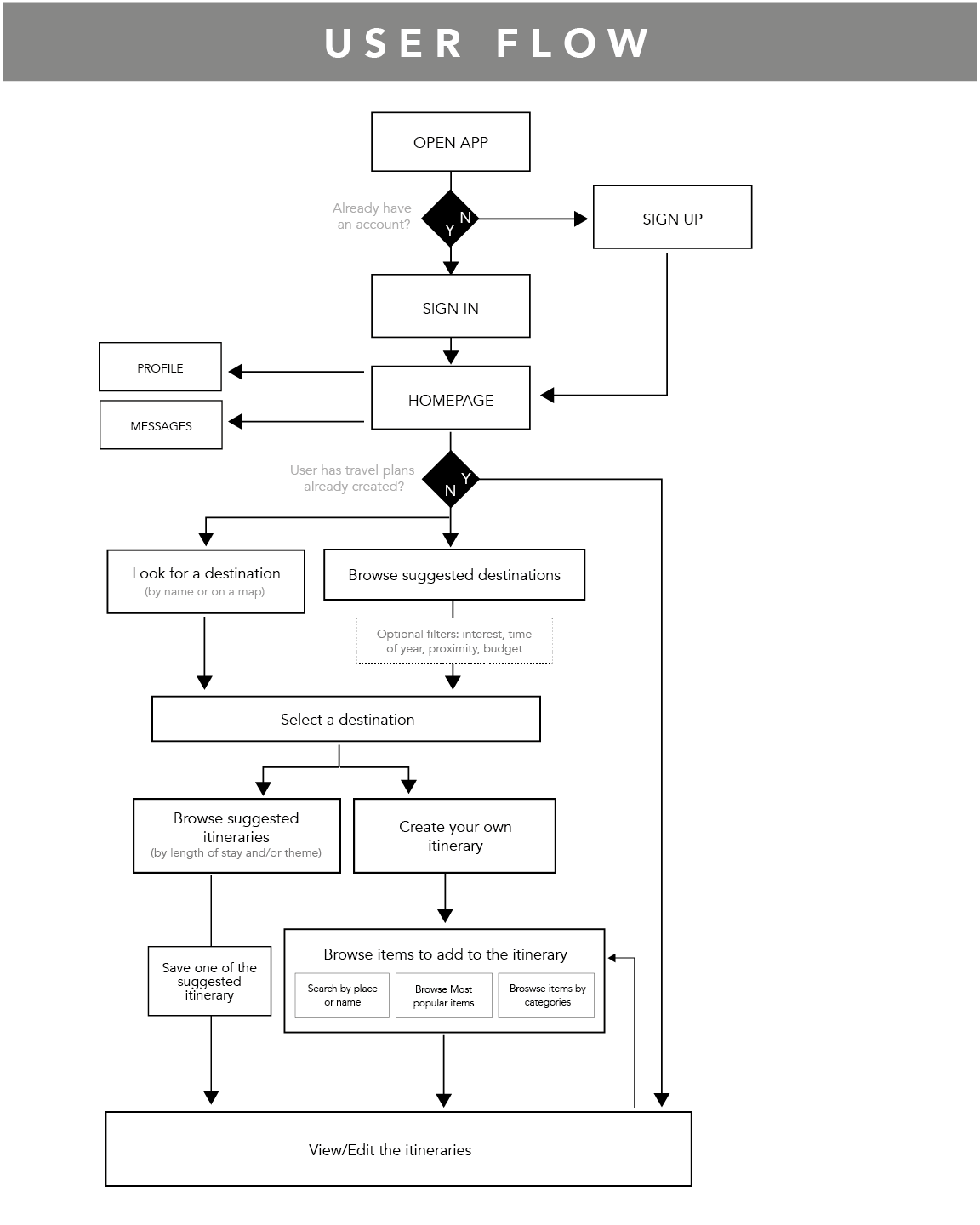
Using the personas and the survey analysis, I was able to flesh out the main functionalities of the app and then put them together in a user flow that explains how a user would use the app to plan a trip.
Users would be able to :
- search for a specific destination
- browse for destinations ideas based on different criteria (time of year, trip length, budget, type of activities, etc.)
- build their own travel plan from start to finish
- browse suggested itineraries and edit them
- share itineraries with others, whether they have the app installed or not
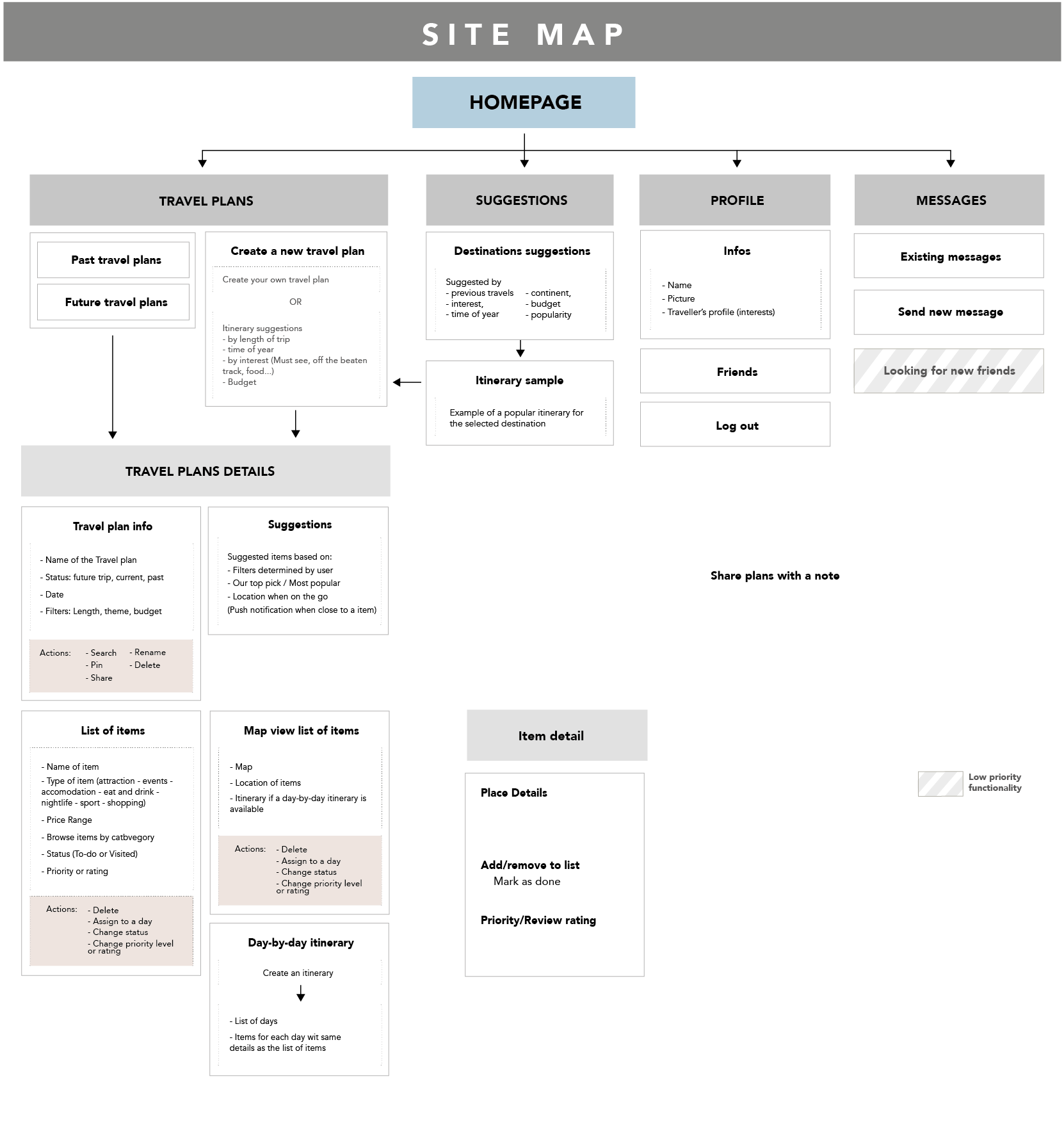
And to better see the pages and screens I would need in the end, I regrouped all the functionalities into a site map.
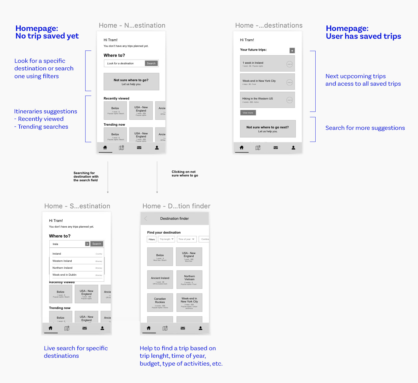
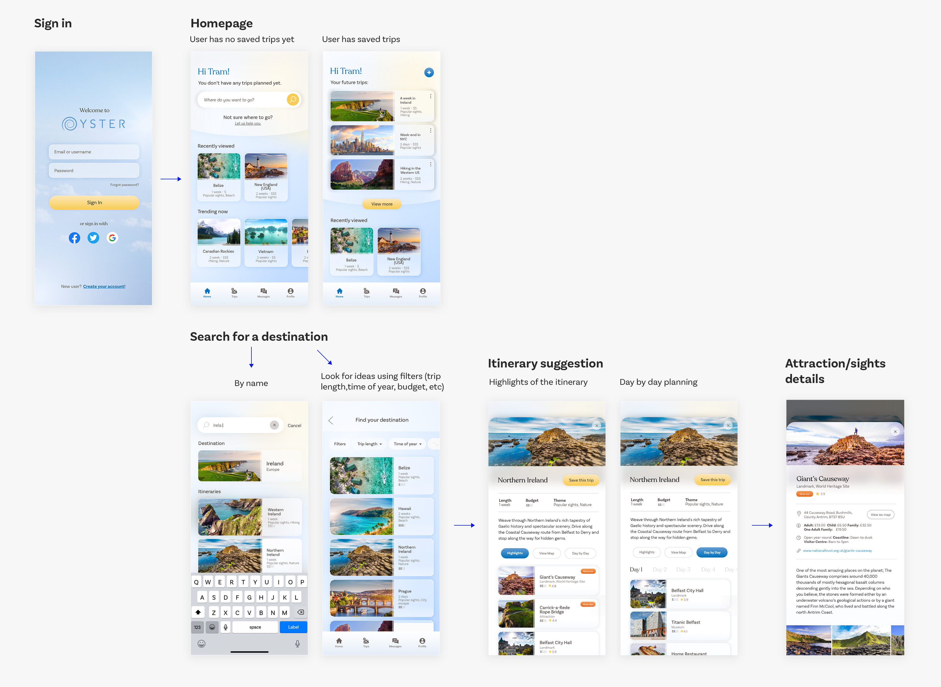
3. Wireframes & Usability testing
Using the user flow and site map, I was able to build the wireframes, to better flesh out what the app would look like, how the content fit and how the functionalities work together. Here are some wireframes examples that I designed:
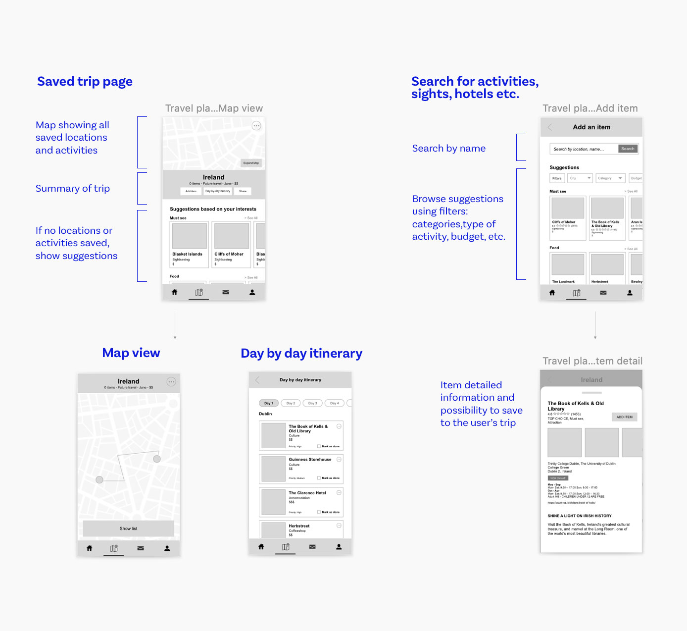
I used the wireframes to do usability testing as well. I asked a few users to perform some specific tasks, such as « Show me how you would plan a trip to Ireland » or ask them to comment on whether what they thought was unclear to them in the interface or in terms of functionalities.
Using notes on what they commented on, I rephrased titles, simplified some content and reworked some of the pages.
For example:
- One user felt a bit confused by the travel plan page, so I made a second version to make it more straightforward. Try to separate the Add item button that was not clearly visible at first, make the suggestions a separate section not to confuse them with the user’s items. The map view was also confusing to have at the same time as the items so I separated them also.
- The function to check off an activity as visited or done wasn't very clear. I changed the "To-do" wording into « Marked as done » and made it more different when it's marked off or not.
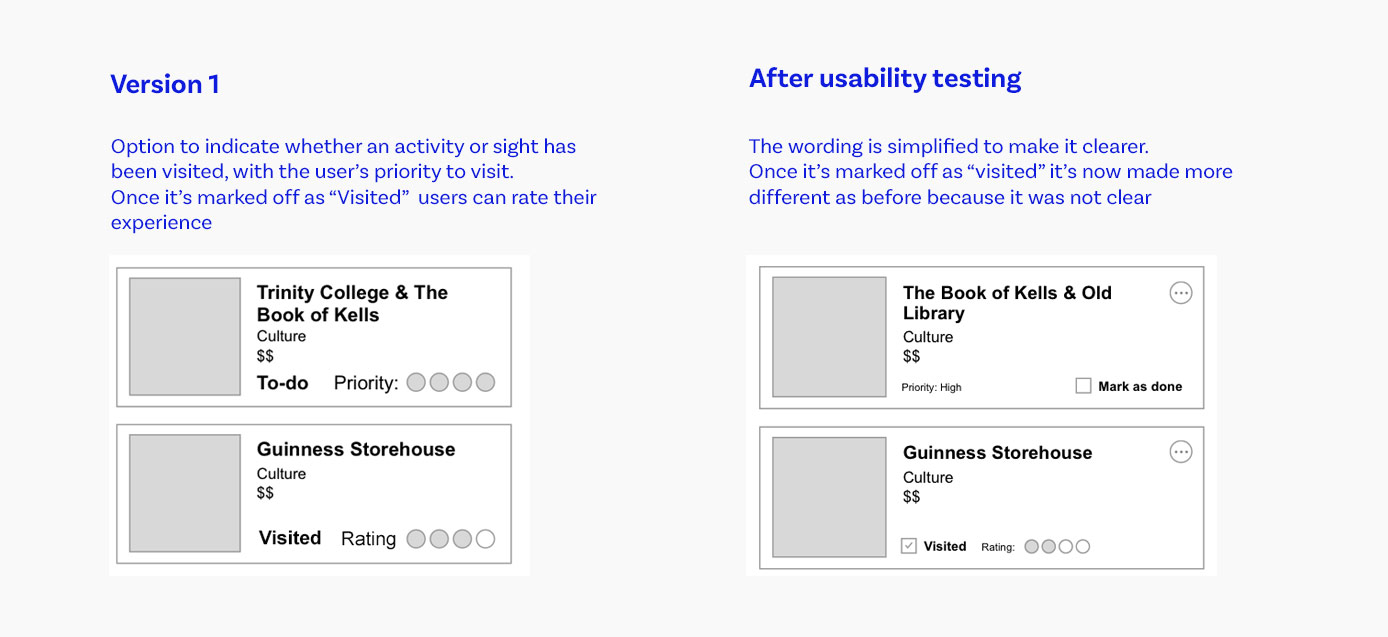
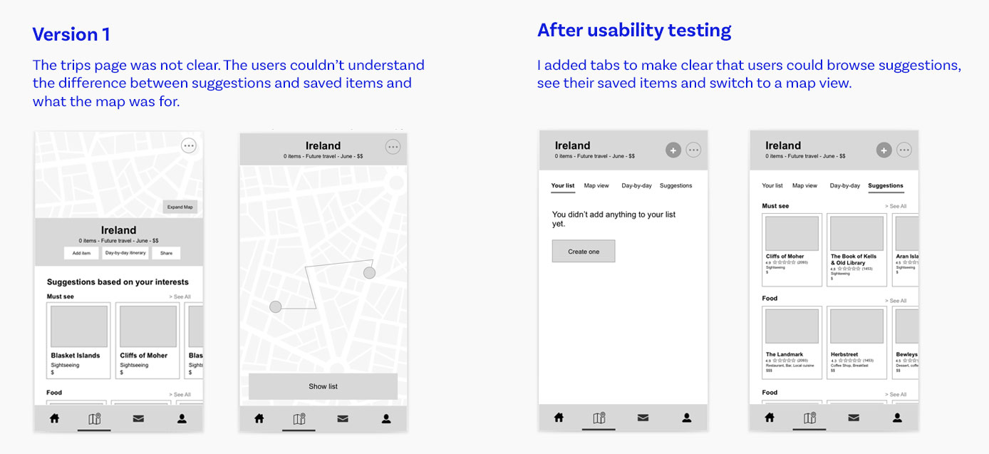
It was valuable feedback to get at the wireframe stage so I could rework the structure of the pages more easily.
4. Visual design
![]() The visual design had to induce a feeling of escape, freedom and simplicity.
The logo is minimalist, simple and typeface based, with a swirl replacing the O. It symbolises a body of water in reference of the name Oyster, and the fact that our planet is majorly composed of water. I opened the lines of the O and the R to make it lighter, and made the space between letters wider to accentuate the sense of escapism, openness and possibility.
The visual design had to induce a feeling of escape, freedom and simplicity.
The logo is minimalist, simple and typeface based, with a swirl replacing the O. It symbolises a body of water in reference of the name Oyster, and the fact that our planet is majorly composed of water. I opened the lines of the O and the R to make it lighter, and made the space between letters wider to accentuate the sense of escapism, openness and possibility.
The colour palette is based on the colour of the sky and water with blue being the main colour. Yellow and orange are the accents, representing shades of a sunset. I chose 2 typefaces: a serif yet modern one to emulate an old-school printed travel guide, and a sans-serif one for longer paragraph for better on-screen readability.
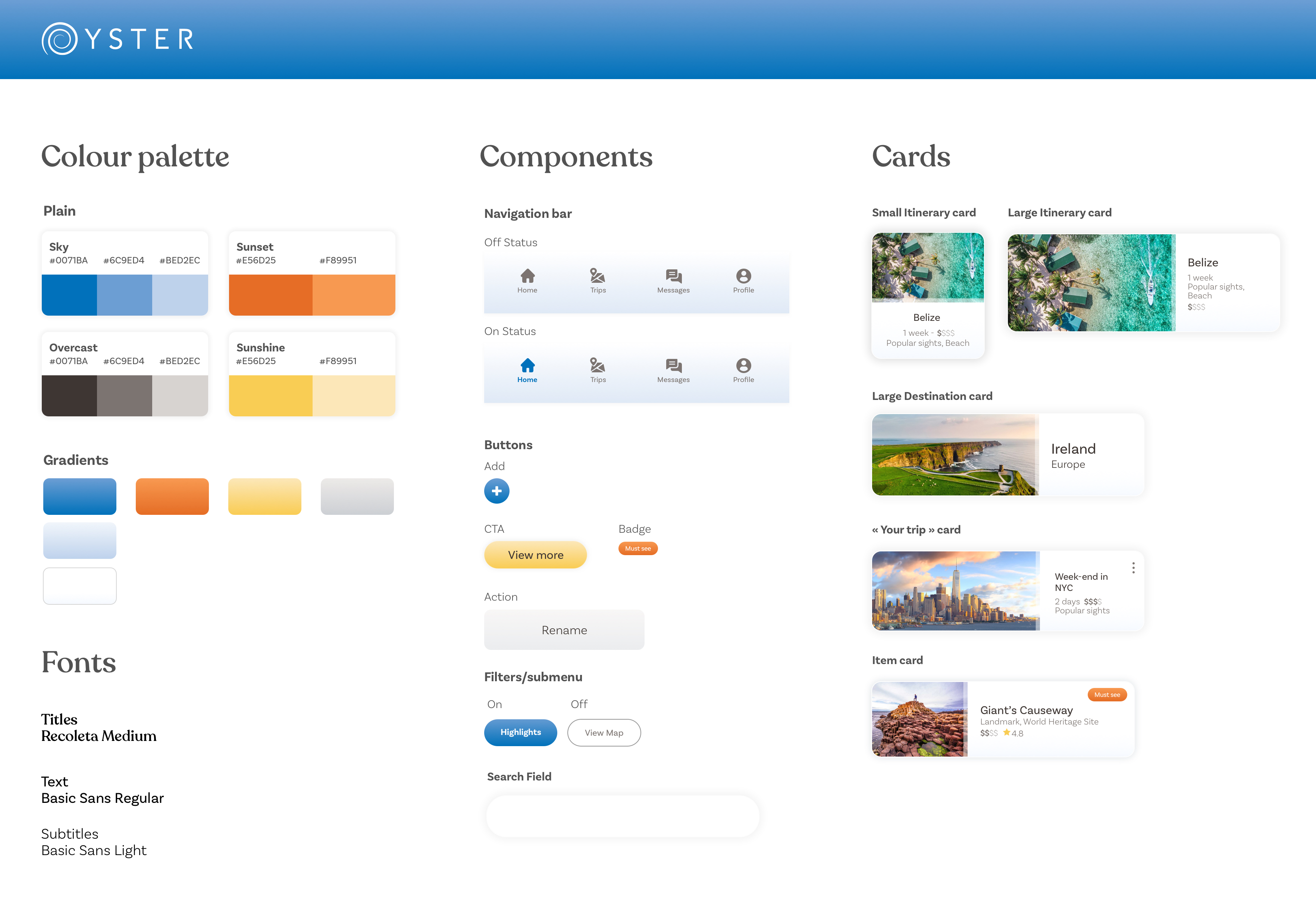
And for the screens I wanted to keep it simple and light to again induce the feeling of escapism, but also to put the importance on the pictures, since travellers (and potential users interviewed) want to see the most beautiful places.
I started by designing the Log in screen, the Homepage and the screens relative to the research part, enough to build a prototype and be able to do usability testing before going any further.
5. More Usability testing (on Hi-fi mock ups)
After creating the clickable protoype, I designed a usability test and did live interviews with potential users to gain their feedback. The test included :
- Context questions: to understand the participant’s behaviour regarding travel and travel planning (if they preferred planning everything themselves or have suggestions, what pain points they usually encounter when travel planning...)
- Usability tasks: to have users interact with the prototype and test functionalities. I asked them:
- For first impression on the home page: to get feedback on the overall visual design and content
- To plan a trip to a specific place: to test the search function
- To look for an idea of a trip for a 1 week vacation: to test the destination finder with the filters
- Follow up questions: to gain more insights on their overall experience and on other functionalities the users would like to see in the app
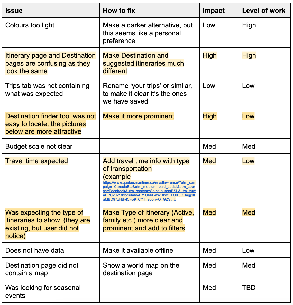
Usability testing findings
After conducting a few usability interviews, I made a summary of some of the issues users encountered while using the prototype and how they could be addressed.
For each of them, I estimated how impactful the changes would be in the final product, as well as the amount of work they would take. I used these two factors to prioritize what to work on next to improve the prototype.
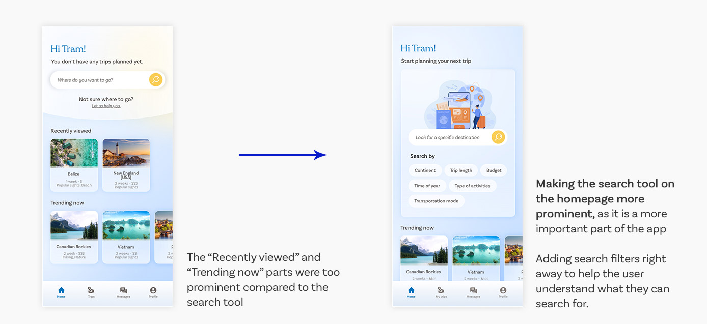
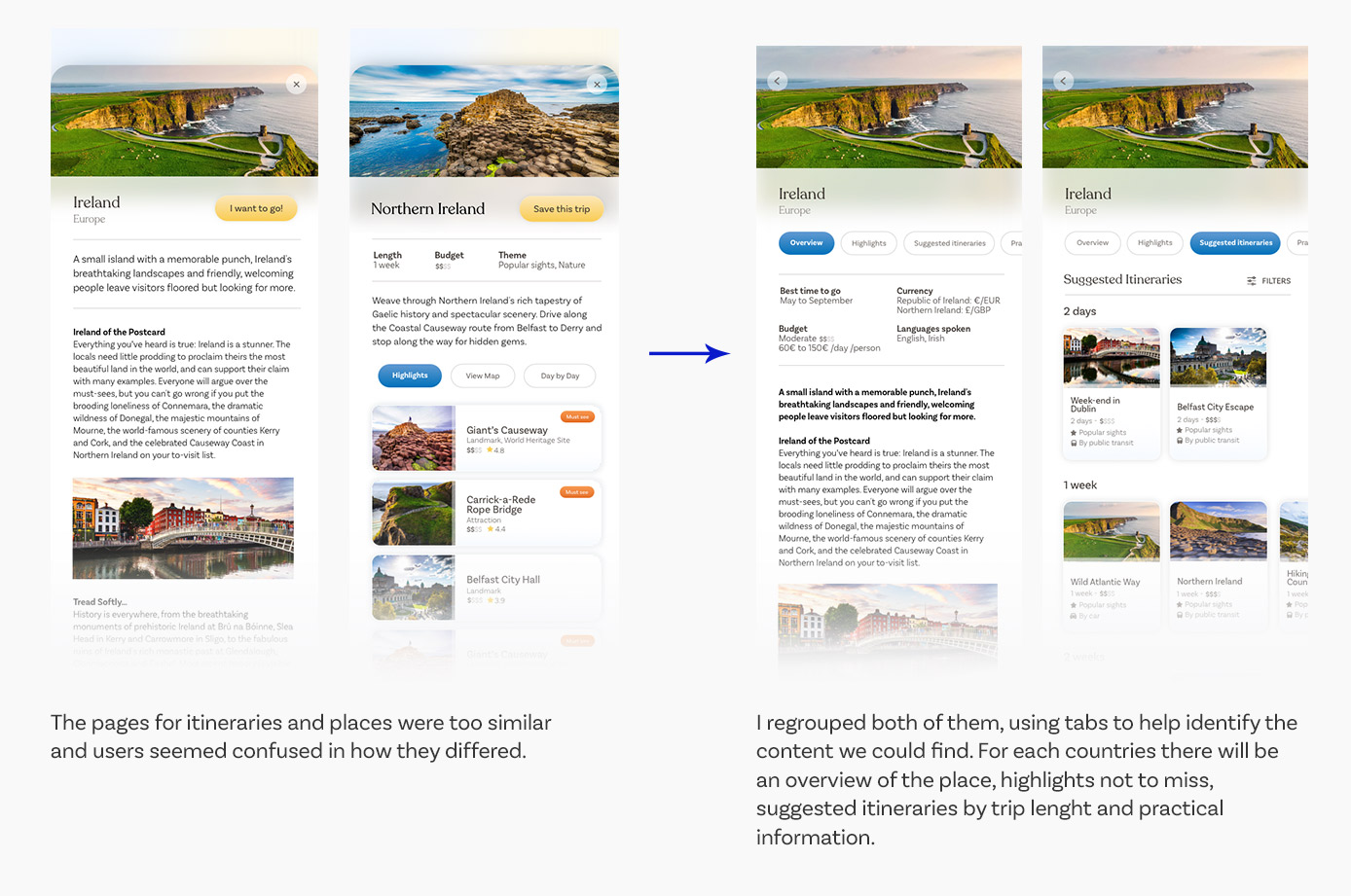
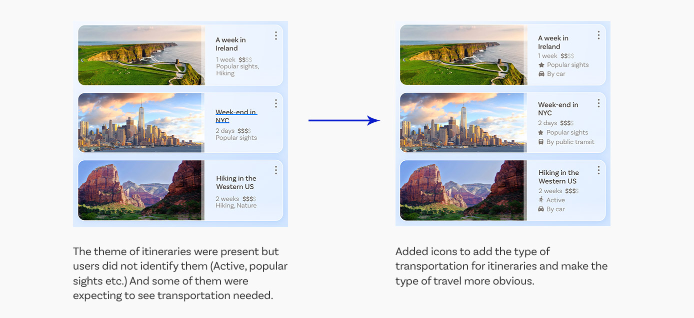
Below are some of the improvements made on the prototype to alleviate some of the users’ pain points:
Prototype improvements based on the results
Learnings
Although it is a passion project and not a shipped product, I used this project to practice various UX skills to apply them on an existing problem space.
I practiced creating user flows and site maps, as well as designing the UI and visual style, but I especially wanted to take this project as an opportunity to talk to real users (in survey or during usability interviews) to gain insights and feedback and integrate these to my work, and create a user-centric product that wasn't just based on my personal experience.