Case Study • UI Design • Branding
Spotted in the 6ix
Project Overview
Entry for Adobe Icon contest, March 2018
In March 2018 Adobe launched a design contest to promote Adobe XD and its prototyping functionality.
The objective was use Adobe XD to create a prototype for an app designed to share inspiring places in your city for creative people, using a predefined icons set.
1. Defining the project
![]() I decided to create an app that would allow user to share their favourite inspiring places in Toronto within the app and with other users.
I decided to create an app that would allow user to share their favourite inspiring places in Toronto within the app and with other users.
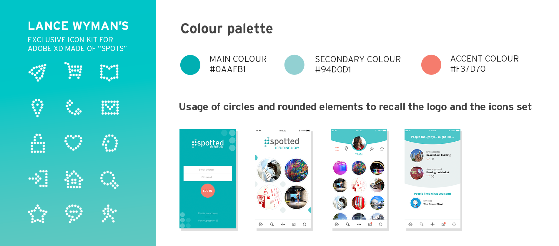
There were 3 icons set provided by Adobe, and we had to choose one to design with. I chose the 3rd set, that was made of little dots. It gave me the idea for the concept of sharing "spots" in the city, as well as the name of the App: Spotted. I simply added "in the 6ix" in the name so that the idea of the App could be replicated in different cities.
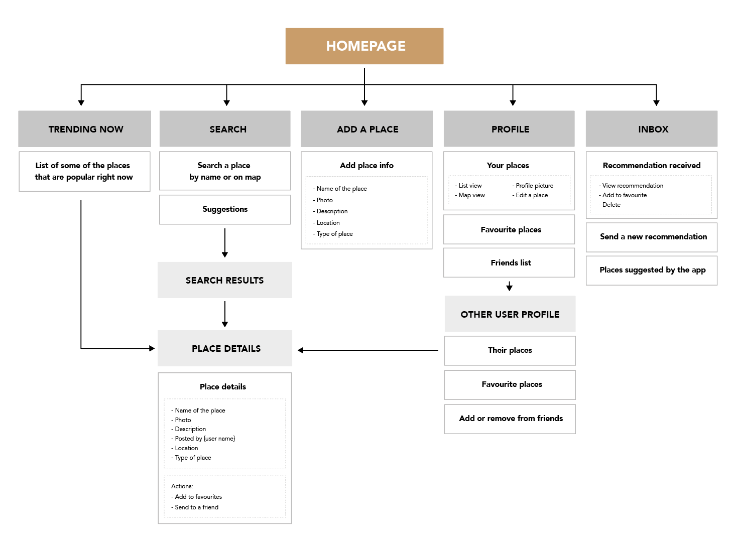
2. Information Architecture
The final deliverable being a prototype, it had to make sense and not just be a few independant designed pages. So, I started with creating a site map to help me mapping out the content and see what pages I would have to design and how they would interact.
The users would all have their own account, where they can post their favourite creative spots in the city. They can have friends with whom they'll be able to share their spots or recommend them new ones.
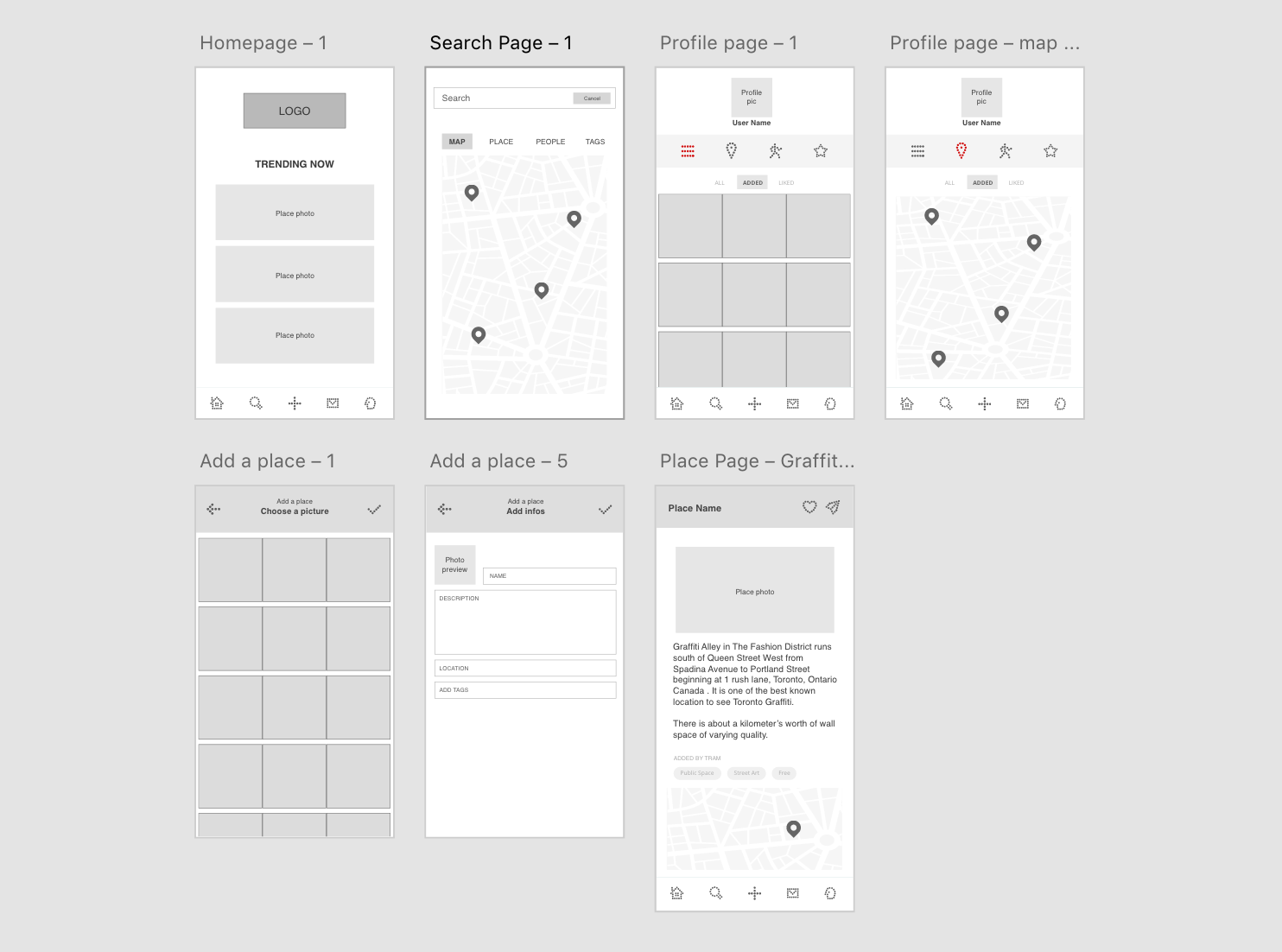
I also created the wireframes of the main pages. I didn't wireframe the entire app for the sake of time, since the contest was running in a rather short time frame. But I still thought it was important to lay out the content and functionalities of the main pages to work on the visual design after that.
3. UI design
![]() The first step was to create a logo, that would set the tone for the rest of the design.
The first step was to create a logo, that would set the tone for the rest of the design.
I reused the dot theme of the Icons set. In the logo, they represent the creative spots of the city, and there are 6 of them to represent Toronto, aka the 6ix. The typeface used is Interstate, that was originally create for signage, which is fitting a project about locations.
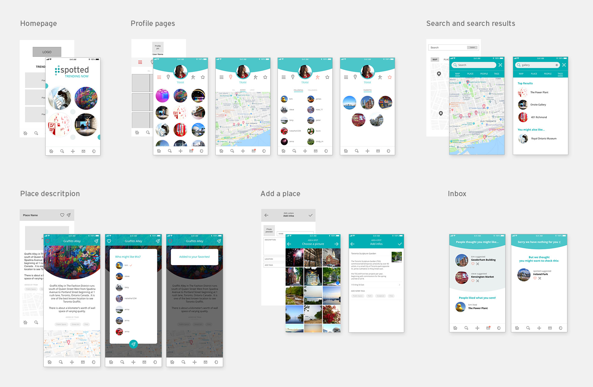
After that I developped a simple colour palette with the greens from the logo and an Orange for the accent colour. I built the entire interface around rounded elements to remind the icons and make them the central element. Then, based on the wireframes I developped the rest of the pages. I had to create enough of them so that the prototype would explain how the app works. You can see the the prototype here.
Learnings
I enjoyed creating a concept based on a simple prompt given by the contest outline. I was able to get creative on both creating the name, the functionalities and branding so it felt like a very diverse project, even if it was a quick one.
It was also the occasion to work with Adobe XD to work on both the UI and the prototyping, which was a different experience that working with Invision for example. It has pros and cons but it's always a good exercise to work with different tool.
And since the contest had a specific and quite short deadline, it was also a good exercise to work on, and still be creative within a short amount of time.